Web Design Tools for Beginners: What to Learn Before You Choose.
The best web design tool for beginners depends on the project, but the learning order should not start with software. Learn layout, typography, color, responsive design.

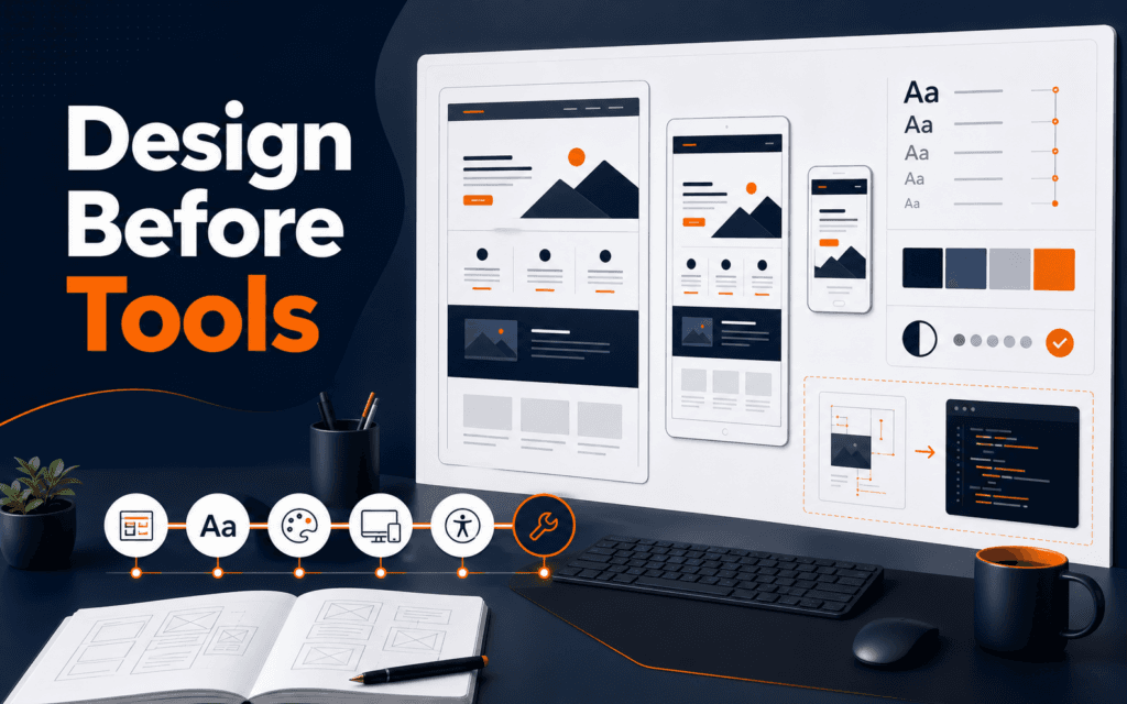
The best web design tool for beginners depends on the project, but the learning order should not start with software. Learn layout, typography, color, responsive design, accessibility, and handoff first. Then choose Figma, Canva, WordPress builders, Shopify editors, code, or another tool based on what you need to make.
A tool can speed up work you understand and hide weak decisions you do not. W3C guidance on accessible design, WCAG 2.2, web.dev’s responsive design lessons, and MDN’s responsive design guide all point to the same foundation: real websites need readable structure and layouts that adapt to users. Rising Edge Web Design builds that foundation, while Full Stack Web Development helps turn designs into working sites.
Learn Layout Before You Learn a Canvas
Layout is the arrangement of content so a reader understands what matters first, second, and third. Before choosing software, learn how spacing, alignment, grouping, and visual hierarchy work. A beginner who understands layout can create a clear page in many tools. A beginner who does not understand layout may keep changing templates without knowing why the page feels confusing.
Start with simple page patterns: hero section, feature grid, testimonial section, pricing block, contact form, blog card list, and footer. Notice how each pattern answers a user need. A hero section gives orientation. A feature grid compares benefits. A contact form reduces friction. A footer provides secondary navigation and trust signals.
Then study spacing. Good spacing is not random empty space. It separates unrelated ideas, groups related items, and gives the reader a comfortable path through the page. Beginners often make everything equally large or equally close together. That removes hierarchy. A better habit is to decide which element deserves attention, then support it with size, spacing, contrast, and placement.
You can practice layout without advanced software. Take an existing website and sketch its sections on paper. Label the purpose of each section. Then recreate the structure in any tool using boxes and text only. If the layout works without colors and images, it has a stronger foundation.
Learn Typography Because Most Websites Are Mostly Text
Typography is one of the fastest ways to make a website feel professional or amateur. Beginners often focus on images and effects, but most pages depend on headings, paragraphs, labels, buttons, navigation, and form text. If the type is hard to scan, the design fails even when the colors look attractive.
Learn the basics first: font pairing, size scale, line height, paragraph width, weight, and contrast. A heading should clearly introduce a section. Body text should be comfortable to read. Button text should be short and action-oriented. Labels should be clear. Long lines should be avoided because they tire the reader.
Typography is also an accessibility issue. Text needs sufficient contrast against the background. Interactive labels should not depend only on color. Pages should remain usable when users zoom or view them on small screens. W3C accessibility guidance repeatedly brings design decisions back to readable, perceivable, and understandable interfaces.
A useful beginner exercise is to design the same section using only typography. No icons, no images, no gradients. Create a heading, a paragraph, three bullet points, and a button. Make the section clear through type size, weight, spacing, and alignment. This exercise builds judgement that transfers to every design tool.
Learn Color as a System, Not Decoration
Color should guide attention, communicate brand, and support readability. Beginners often choose colors because they look exciting in isolation. On a real website, colors need roles. A brand color may be used for key actions. A neutral color may support backgrounds and borders. A warning color should not be used casually. A text color must remain readable.
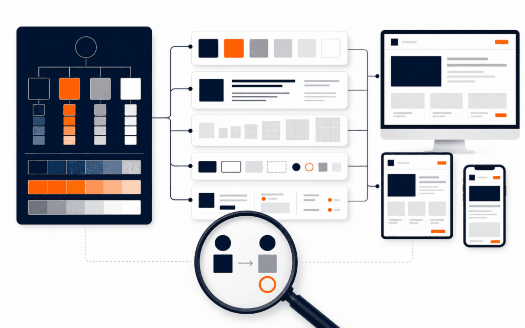
Before choosing a tool, learn how to build a small palette: primary color, secondary accent, background, surface, border, heading text, body text, muted text, success, warning, and error. You do not need dozens of colors. You need enough roles to keep the interface consistent.
Contrast is the practical test. If users cannot read the text, the design is not working. WCAG 2.2 provides formal accessibility criteria, but beginners can start with a simple habit: test text and button contrast early, not after the page is finished.
Color should also respect the content. A learning platform, healthcare site, portfolio, restaurant, and software dashboard should not all feel the same. The palette should match the audience and the task. Good tools provide color controls, but the designer still decides whether the palette supports the message.
Learn Responsive Design Before You Trust Templates
Responsive design means the layout adapts to different screen sizes, input methods, and content lengths. A page that looks clean on a laptop can break on a phone if the designer has not planned stacking, wrapping, spacing, image cropping, and navigation behavior.
web.dev and MDN both teach responsive design as a core web skill, not an optional finishing step. Beginners should learn concepts such as flexible grids, relative units, breakpoints, fluid images, and content priority. You do not need to master every CSS detail before using design software, but you should understand what must change between desktop and mobile.
Ask these questions for every design:
- Identify the most important action on mobile.
- Decide which columns should stack first.
- Plan for headings that become two or three lines.
- Keep buttons large enough to tap.
- Confirm that navigation still works when space is limited.
- Crop images without hiding important information.
Many beginner tool comparisons ignore this. A tool that is easy for desktop mockups may still require careful thinking for responsive behavior. If your goal is to design real websites, choose a tool that helps you preview and reason about different screen sizes.
Learn Accessibility as Part of Design Quality
Accessibility is not a separate checklist you add at the end. It is part of good web design from the beginning. Designing accessible websites means thinking about contrast, text size, focus states, keyboard navigation, form labels, error messages, alt text, headings, and predictable interaction.
For beginners, the most useful starting point is practical: people should be able to perceive the content, understand the page, navigate controls, and complete the main task. W3C’s design tips include clear page structure, sufficient contrast, labels, meaningful feedback, and support for users who interact in different ways.
This matters even for visual designers. A beautiful form with vague labels creates friction. A low-contrast button may be invisible to some users. A menu that only works with hover may fail on touch devices. Accessibility improves the product for more people and often makes the design cleaner for everyone.
A strong beginner tool should not encourage inaccessible habits. Look for support for text styles, contrast checking, semantic export or developer handoff, focus states, and responsive previews. If a tool makes everything a flat image, it may be useful for quick visuals but limited for real web design.
How to Choose Your First Web Design Tool
Once you understand the foundations, the tool decision becomes practical. Choose based on the kind of work you want to do in the next three months.
| Goal | Useful Tool Direction | What to Learn Alongside It |
|---|---|---|
| Design website mockups | Figma or another interface design tool | Layout systems, components, responsive frames, handoff notes |
| Create quick marketing graphics | Canva or template-based design tools | Typography, brand consistency, visual hierarchy, export quality |
| Build WordPress pages | WordPress block editor or page builder | Content structure, responsive settings, performance basics, accessibility |
| Design online stores | Shopify theme editor and design tools | Product page hierarchy, trust signals, checkout clarity, mobile commerce |
| Understand design to code | Code editor with HTML, CSS, and JavaScript | Responsive CSS, semantic HTML, components, browser testing |
Do not choose a tool only because it is popular. Choose the one that matches your next project. If you want to present UI concepts, Figma makes sense. If you need social visuals, Canva may be enough. If you want to publish a real website, WordPress or code matters. If you want to become a stronger professional, learn how the design decisions transfer across tools.
A Beginner Practice Plan
Use a four-week practice plan before investing too much time in one tool.
Week one: recreate three website sections in grayscale. Focus only on layout, spacing, and hierarchy. Do not use images or decorative colors.
Week two: create a typography system. Define heading sizes, body text, captions, button text, and form labels. Apply the system to a landing page section and a blog card layout.
Week three: add color and accessibility checks. Build a small palette, test contrast, and design normal, hover, focus, and error states for a form.
Week four: make the design responsive. Create desktop, tablet, and mobile versions. Write notes explaining what changed and why. If possible, hand the design to a developer or build a simple HTML/CSS version yourself.
This plan works in almost any tool. That is the point. It teaches design judgement before tool dependency.
Common Mistakes Beginners Make
The first mistake is collecting tools instead of practicing decisions. Installing more software will not fix weak layout or unclear content.
The second mistake is copying templates without understanding structure. Templates are useful for learning patterns, but beginners should ask why each section exists and how it guides the reader.
The third mistake is designing only for desktop. Many users will experience the site on mobile. Responsive decisions should be made early.
The fourth mistake is treating accessibility as advanced. Contrast, labels, readable text, and clear focus states are beginner fundamentals.
The fifth mistake is ignoring handoff. A design is more useful when developers or builders can understand spacing, styles, assets, interactions, and responsive behavior.
Students considering the Web Design and Front-End Development can practise this comparison framework from Gujrat or through live online classes across Pakistan. This makes the course decision more concrete because the learner can evaluate the subject through an actual workflow instead of a broad description.
FAQ
What is the best web design tool for beginners?
There is no single best tool for every beginner. Figma is strong for interface mockups, Canva is useful for quick graphics, WordPress builders help publish real pages, and code teaches how the web actually works. The best first tool is the one that matches your next project while helping you practice layout, typography, responsiveness, and accessibility.
Should I learn web design before coding?
You can start with either, but learning basic design before or alongside coding helps you build clearer pages. If your goal is full website creation, combine design fundamentals with HTML, CSS, responsive layout, and browser testing.
Can templates teach web design?
Templates can teach patterns if you study them actively. Ask what each section does, how hierarchy is created, how spacing works, and how the layout changes on mobile. Do not only replace text and colors.
Next Step
Pick one tool and one small project: a course landing page, a portfolio homepage, or a local business contact page. Build it three times: grayscale layout, styled desktop design, and responsive mobile version. By the end, you will know much more than which button the software uses. You will understand the design decisions that make any web design tool useful.
Want to Build Practical Technology Skills?
Explore RisingEdge courses designed to help students learn real skills, build projects, and prepare for career opportunities.