Web Design Tool Selection: Wireframes, Prototypes, Handoff, QA
Web design tool selection should start with the workflow, not the trend. A beginner needs tools for wireframes, visual design, components, prototypes, developer handoff.

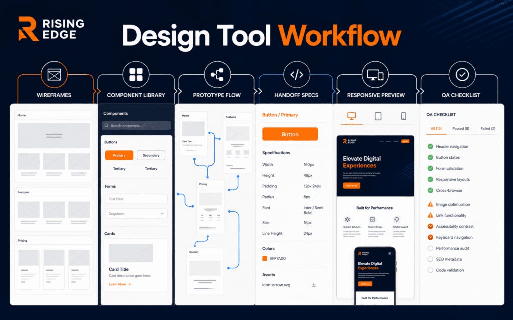
Web design tool selection should start with the workflow, not the trend. A beginner needs tools for wireframes, visual design, components, prototypes, developer handoff, accessibility checks, responsive review, and QA notes.
W3C’s WCAG guidance defines accessibility expectations for web content, and MDN explains responsive design as making pages work across screen sizes. Those standards remind us that design tools should help produce usable websites, not only attractive screens.
Choose Tools By Stage
Every design stage has a job. Early sketches explore ideas. Wireframes clarify structure. Visual tools define hierarchy, typography, color, and spacing. Prototypes test interaction. Handoff tools help developers build accurately.
A tool is useful when it improves a decision or deliverable. If it only creates prettier clutter, it is not helping the project.
The Web Design course fits this workflow because students need to connect design decisions to real pages.
Use Simple Wireframing First
Wireframes should be fast and low-detail. Use boxes, labels, sections, and content priority before selecting colors or images. The goal is to decide what belongs on the page and how users move through it.
A beginner can wireframe on paper, a whiteboard, Figma, FigJam, or any simple layout tool. The tool matters less than the questions: what is the page goal, what does the user need first, and what action should be easy?
Do not skip wireframes for complex pages. They reveal hierarchy problems before visual polish hides them.
Design With Real Content
Design tools become misleading when every card uses perfect placeholder text. Use realistic headings, course names, prices, dates, form labels, errors, and image ratios.
Real content shows whether the layout can handle long words, mixed-length titles, mobile wrapping, and empty states. It also prevents a design from looking good only in a mockup.
This connects to the Graphic Design course, where hierarchy, type, contrast, and composition shape communication.
Build A Small Component System
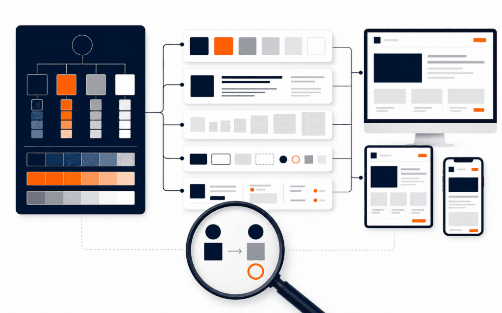
A component system does not need to be huge. Start with buttons, inputs, cards, nav items, alerts, badges, tabs, and section spacing. Define states such as hover, focus, disabled, error, and loading.
Components make design faster because repeated decisions become consistent. They also help developers understand what should be reused.
Name components clearly. A button called primary action is easier to hand off than a random layer called rectangle 42.
Prototype Only The Important Flow
A prototype should answer a question. Can the user find the course? Can they open details? Can they submit the form? Can they recover from an error?
Do not prototype every screen if the important uncertainty is one interaction. Prototype the smallest flow that reveals the problem.
Ask reviewers to complete a task, not to comment generally. Their hesitation often reveals more than their opinions.
Check Accessibility Inside The Tool
Accessibility starts before development. Check contrast, readable text sizes, focus order, labels, touch targets, and visible error states in the design stage.
WCAG is detailed, but beginners can begin with practical checks: sufficient contrast, keyboard-visible states, descriptive labels, clear headings, and no information conveyed by color alone.
A design that ignores accessibility will create rework for developers and friction for users.
Review Responsive Behavior
Responsive design should not be guessed after desktop approval. Create desktop, tablet, and mobile versions for key pages. Decide what stacks, what hides, what changes order, and how navigation behaves.
MDN describes responsive design as making pages render well across devices and screen sizes. In practice, that means designing with flexible content and constraints.
Test long titles, large images, forms, cards, and buttons on small widths. Mobile problems often come from content length, not only screen size.
Prepare Developer Handoff
Developer handoff should include layout rules, spacing, colors, typography, assets, states, breakpoints, component names, interactions, and content notes.
Do not expect developers to infer every detail from a static screenshot. A clean handoff reduces back-and-forth and improves the final website.
Add notes where behavior matters: sticky nav, form validation, animation timing, empty state, loading state, and error state.
Use QA Tools After Build
After development, compare the built page with the design for spacing, hierarchy, typography, responsive behavior, accessibility, and content accuracy.
A QA checklist should include public URL, mobile layout, forms, links, metadata, image loading, keyboard navigation, and visual consistency.
The SEO course connects because design QA and SEO QA both protect public page quality.
Compare Tool Output With Browser Reality
A design tool is not the website. After development, open the built page in a browser and compare real rendering with the approved design. Fonts, line breaks, image crops, animations, and form states can change after implementation.
Use browser inspection for spacing, responsive behavior, accessibility attributes, and loaded assets. If a design handoff promised one interaction but the browser delivers another, the live page is the source of truth.
Keep notes for differences that are intentional. Some changes are good adaptations, but they should be recorded so future designers do not treat them as accidental mistakes.
Avoid Tool Overload
Beginners do not need ten tools. Choose a small stack and learn it deeply. A strong starting stack might include one design tool, one whiteboarding method, one accessibility checker, and one browser inspection workflow.
Switch tools when a real workflow problem appears, not because a new tool is popular. Consistency helps you finish work and build judgment.
A portfolio should show design reasoning, responsive decisions, and handoff clarity, not only tool names.
Choose Tools That Fit The Team
A solo learner can choose tools differently from a team. Teams need comments, version history, shared libraries, developer access, export controls, and clear ownership. A freelancer may prioritize speed, client review, and easy handoff.
Ask who must open the file, who approves the design, who builds it, who maintains components, and who checks the finished page. Tool choice should support those people.
The best workflow is the one the team will actually use consistently, especially during revisions and urgent fixes.
Build A Practice Project
A strong beginner project is a three-page course website: homepage, course detail page, and contact form. Wireframe it, design components, prototype the form path, write handoff notes, and compare the built page with the design.
This project tests the full tool chain without becoming too large. It includes navigation, content hierarchy, cards, forms, responsive behavior, and QA.
Save before-and-after screenshots and a short decision note. That evidence makes the portfolio more convincing than a static mockup alone.
Review Cost And Access
Tool selection also includes budget and access. A premium tool may be worth it for a team, but a beginner should not confuse subscription cost with skill level.
Check free-plan limits, export options, collaborator seats, file ownership, offline access, and whether developers can inspect specs without needing a designer’s private account.
Good tool choices reduce friction. If a client, instructor, or developer cannot review the work easily, the tool is creating a handoff problem.
Avoid Mockup-Only Thinking
A web design file is not complete until it anticipates real content, real interaction, and real implementation. Mockup-only thinking produces beautiful screens that fail in forms, navigation, responsive states, or accessibility.
Ask how the design behaves when a title is long, an image is missing, a user submits invalid data, or a section has only one item. These cases shape professional interfaces.
The stronger designer is not the person with the fanciest file. It is the person whose design survives the real website.
Decide What Not To Use
Tool selection also means saying no. A project may not need advanced animation, complex design-system tooling, paid stock libraries, or heavy prototype logic.
Removing unnecessary tools keeps beginners focused on fundamentals: structure, hierarchy, typography, spacing, interaction, accessibility, and handoff.
A smaller toolset is easier to teach, easier to review, and easier to repeat on the next project.
Document The Tool Decision
Write a short decision note after selecting tools. Include why the tool was chosen, which workflow stage it supports, what alternatives were rejected, and what limitations the team should remember.
This note helps future projects move faster because the team can reuse the reasoning instead of restarting the same debate every time during later revisions and final reviews.
Final Selection Checklist
Before choosing a tool, ask what stage it supports, what deliverable it improves, whether collaborators can use it, whether it supports real content, and whether it helps handoff or QA.
Good web design tools make decisions clearer. The best tool is the one that helps your team move from user need to usable website with less confusion.
When comparing the UI/UX Design program, look for tool choices that are taught through a complete design process rather than isolated software demonstrations. The learner should be able to justify the artifact, fidelity, and handoff detail chosen for each stage.
Include export and handoff constraints in the tool trial. A fast prototype tool is a poor fit if developers cannot inspect spacing, states, assets, and responsive behavior without rebuilding the design assumptions.
This topic also has a local training use for students in Gujrat, Punjab, Pakistan: this checklist can be compared with practical exercises in the UI/UX Design. Confirm current batch requirements directly and judge the learning path by inspectable work.
FAQ
What web design tool should beginners learn first?
Choose one tool that supports wireframes, visual design, components, prototypes, and handoff, then learn the workflow deeply.
Why are wireframes important?
Wireframes clarify structure, priority, and user flow before visual details make weak decisions harder to see.
What should be included in design handoff?
Include spacing, typography, colors, assets, component states, responsive behavior, interactions, content notes, and QA expectations.
Want to Build Practical Technology Skills?
Explore RisingEdge courses designed to help students learn real skills, build projects, and prepare for career opportunities.