Responsive Layout Testing: Mobile Checks Before Publishing
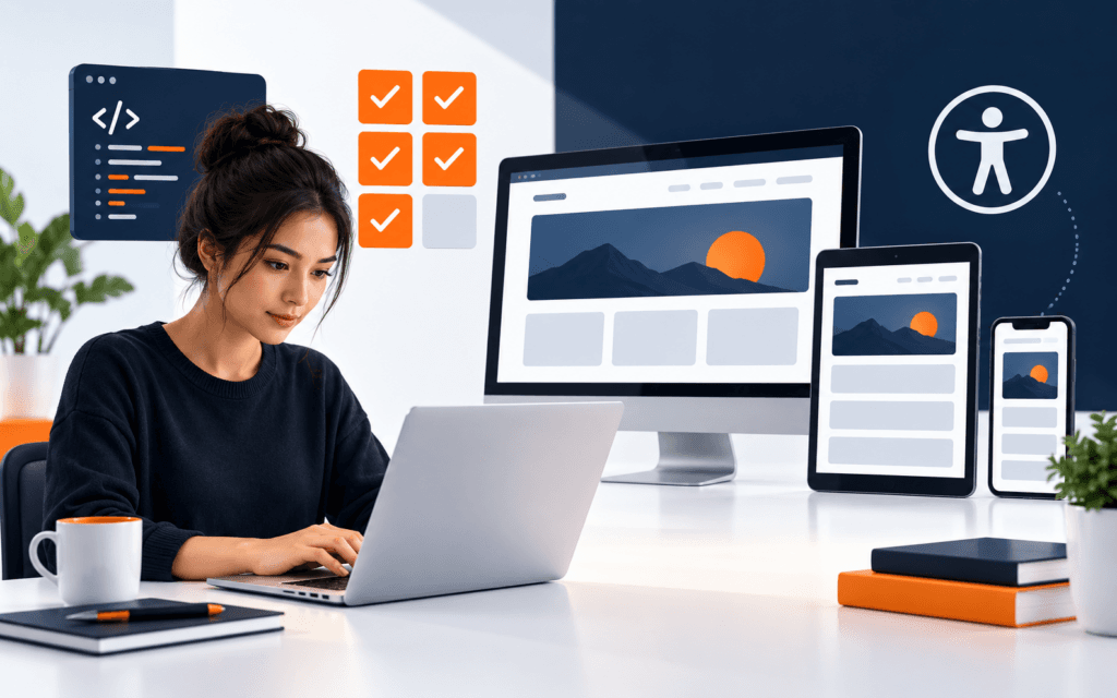
Responsive layout testing helps beginners catch mobile problems before a web page goes live. The practical check covers layout structure, assets, browser inspection, tap targets.

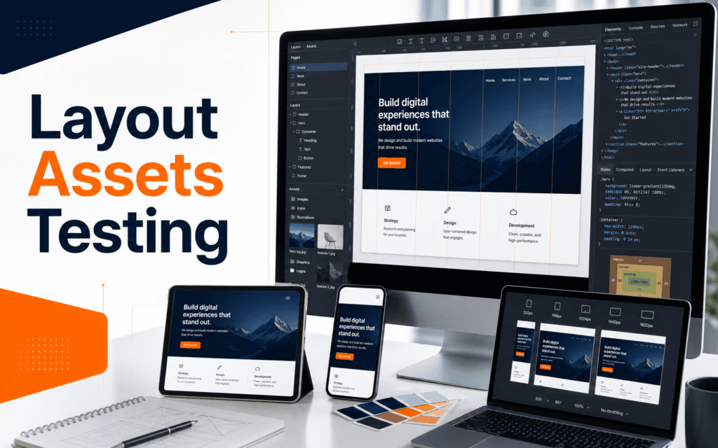
Responsive layout testing helps beginners catch mobile problems before a web page goes live. The practical check covers layout structure, assets, browser inspection, tap targets, headings, images, and breakpoints. A beginner does not need every design platform or plugin. The useful starting stack is a wireframe tool, a visual design tool, an asset organizer, a browser inspector, and a responsive testing routine.
The point of tools is not to make a design look busy. The point is to help a beginner make clearer decisions. A good web design tool should help you answer where content belongs, how the page should guide attention, whether images and icons support the message, and whether the layout still works on mobile.
Start With Layout Before Decoration
Beginners often open a design tool and start choosing colors, shadows, and images immediately. That feels creative, but it can hide the real problem. Web design begins with structure. The page needs a purpose, information order, navigation path, and clear action.
A wireframe tool can be as simple as paper, a whiteboard, Figma, Penpot, or a clean drawing app. The tool matters less than the habit. Sketch the header, main message, supporting sections, proof, frequently asked questions, and action area before styling. Use grey boxes and plain labels first.
This keeps attention on hierarchy. A homepage, course page, contact page, and blog article do different jobs. A course page needs a clear learning outcome, module overview, audience fit, and enquiry path. A blog article needs readability, internal links, and a clean path to related learning. If those decisions are weak, polished visuals will not save the page.
Students in the Web Design course should treat wireframes as thinking tools. They are not final artwork. They are a way to test page logic before spending time on details.
Use Visual Design Tools To Build Systems
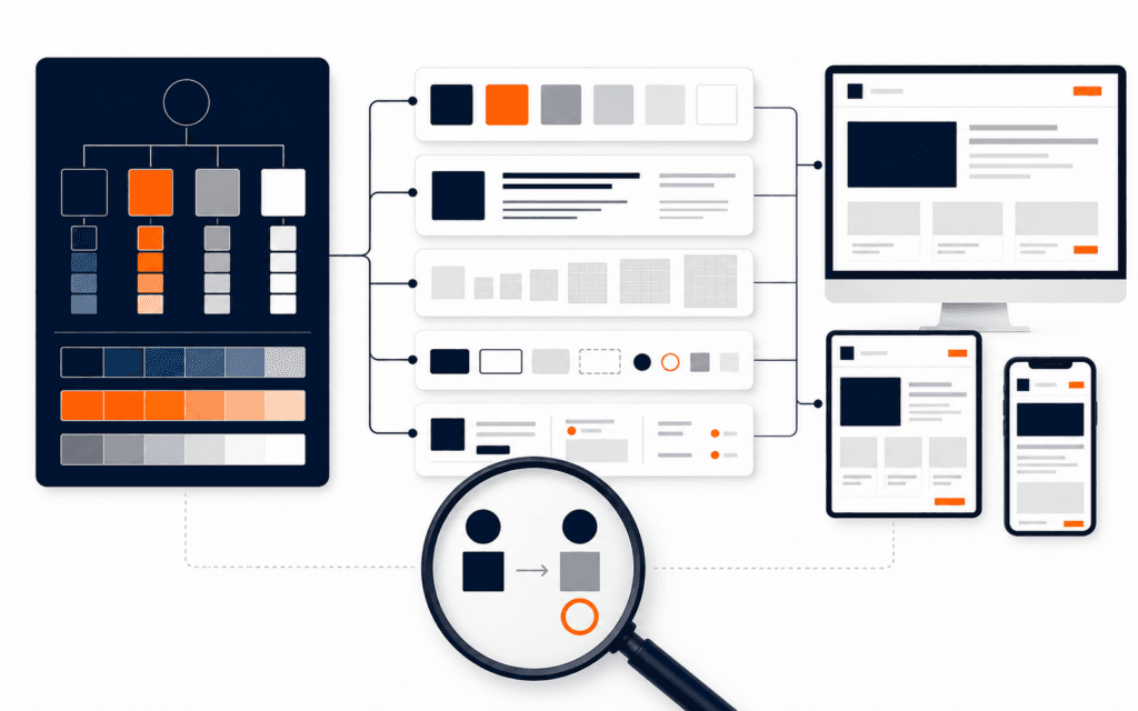
A visual design tool is useful when it helps create reusable decisions. Beginners should create a small design system: heading styles, paragraph styles, button styles, spacing values, color tokens, image treatments, and component patterns. This makes the design more consistent and easier to update.
Do not start by downloading a large UI kit. Large kits can distract beginners from learning why decisions work. Start with a few patterns: header, hero area, feature row, course card, testimonial, FAQ item, and footer. Build them carefully, then reuse them.
The most valuable feature in a design tool is not the effect panel. It is alignment, spacing, components, and preview. Use grids. Check edges. Keep related items close and unrelated items separated. Test whether the same component still looks good when text becomes longer.
Visual design also connects with graphic design fundamentals. Typography, contrast, color, and image quality matter on the web. The Graphic Design course pairs naturally with web design because weak visual hierarchy becomes even more visible when a page has to work across devices.
Prepare Assets Before Building The Page
Assets include logos, images, icons, illustrations, videos, downloadable files, and brand colors. Beginners often collect assets randomly and then struggle to make the page feel consistent. A better workflow is to prepare assets before building.
Create a project folder with clear names. Store logo files, source images, optimized images, icons, and final exports separately. Use descriptive filenames. Avoid files called final-new-copy-2. A clean asset folder saves time and reduces mistakes.
Image selection should serve the page purpose. A course page needs real learning context or a clear visual that explains the skill. A portfolio page needs work samples. A service page needs trust and clarity. Do not use a generic background photo because the layout feels empty. Fix the layout first.
Asset quality affects performance too. Large images can slow a page. Tiny images can look blurry. Use the right dimensions and compression. Keep original source files, but publish optimized versions.
Learn Browser Tools Early
The browser is one of the most important web design tools. Beginners should learn to inspect elements, test spacing, review responsive sizes, check image loading, and identify CSS rules. Browser tools turn design into evidence.
When a layout looks wrong, inspect it. Check width, padding, margin, display type, font size, and image dimensions. This is more useful than guessing. A beginner who learns browser inspection becomes faster at fixing real pages.
Browser tools also reveal accessibility and performance clues. You can inspect headings, alt text, color contrast through available panels or extensions, layout shifts, and network requests. You do not need to master every panel at once. Start with elements, device toolbar, and network basics.
This habit helps students move from mockups to real websites. A static design can look perfect, but the browser shows how content behaves when it becomes interactive and responsive.
Test Responsive Design As A Workflow
MDN describes responsive web design as an approach for pages to render well on different screen sizes and resolutions while keeping usability. Google’s web.dev similarly explains responsive design as adapting layout to users’ devices and capabilities. This is not a final bonus check. It is part of the design process.
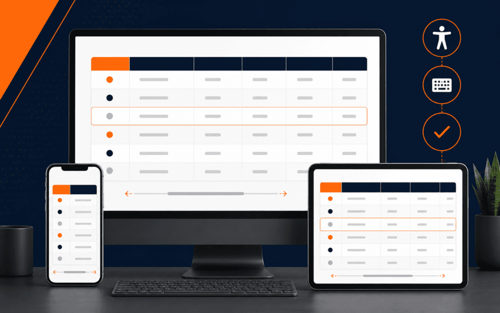
Test early at mobile, tablet, laptop, and wide desktop widths. Watch for crowded navigation, oversized headings, images that crop badly, buttons that wrap awkwardly, and sections that become too tall. If a section fails on mobile, do not simply shrink everything. Reconsider the layout.
Media queries are one tool for this work. MDN explains that media queries apply CSS based on device media type or characteristics such as viewport width, resolution, and orientation. Beginners should understand the idea even when using a visual builder. Different screens may need different layout rules.
Container queries are also worth knowing as a modern concept. MDN explains that container queries let styles respond to an element’s container rather than only the viewport. Beginners do not need to master them immediately, but they should understand that responsive design is moving beyond one set of page-wide breakpoints.
Choose Tools By Skill Stage
In the first stage, use simple tools. Paper or a basic whiteboard for wireframes, a visual design tool for layout, a folder system for assets, and browser device preview for testing are enough. The goal is to understand structure.
For the second stage, add components, style guides, image optimization, and accessibility checks. The goal is consistency. A beginner should be able to change a color, spacing value, or card design without rebuilding the whole project.
During the third stage, add handoff and implementation tools. This may include code editors, version control, design tokens, CSS frameworks, or collaboration systems. These are valuable when the student is ready to connect design decisions with production websites.
Do not choose a tool only because it is popular. Choose it because it solves the current learning problem. Weak hierarchy needs layout review, not another plugin. Poor responsive behavior needs width testing and layout rules. Inconsistent visuals need a small style system.
What To Put In A Beginner Toolkit
A practical toolkit should include a place for rough wireframes, a place for polished layouts, a reliable image workflow, a browser for inspection, and a simple issue log. The issue log is underrated. Each time a design fails on mobile, write the problem, the suspected cause, the fix, and the result. That record turns mistakes into reusable knowledge.
Keep tool count low while learning. One design app used well is better than five apps used casually. Once the workflow is stable, add specialized tools for icons, image compression, accessibility, or code handoff.
A Practical Beginner Stack
Use one planning tool, one design tool, one asset workflow, one browser testing routine, and one publishing environment. For example, sketch the page structure, build the layout in a design tool, organize assets in a project folder, test responsive states in the browser, and publish through a website platform or code project.
Practice with one page first. A course landing page is a useful project. It needs a headline, outcome, modules, audience fit, instructor or institute credibility, FAQ, and contact path. Build the wireframe, prepare assets, design the desktop and mobile view, then test the real page.
Keep a short review checklist. Confirm that the first screen explains the page purpose, headings remain readable on mobile, buttons are easy to tap, images support the message, spacing makes groups clear, and the page still works when text is longer than expected.
The best web design tools do not replace design thinking. They make design thinking visible. Learn layout, assets, and testing as one workflow, and every tool becomes easier to judge.
Students considering the Web Design and Front-End Development can practise the practical approach in this article from Gujrat or through live online classes across Pakistan. This makes the course decision more concrete because the learner can evaluate the subject through an actual workflow instead of a broad description.
FAQ
What web design tool should beginners learn first?
Start with a simple wireframe method and one visual design tool. The first goal is to understand layout, hierarchy, spacing, and responsive behavior.
Do beginners need coding for web design?
Beginners can start visually, but understanding HTML, CSS, browser inspection, and responsive rules makes them much stronger. Even basic code knowledge improves design decisions.
How should I test a web design before publishing?
Preview the page on mobile, tablet, laptop, and wide desktop widths. Check headings, navigation, buttons, images, spacing, loading, and whether the page still answers the user’s main need.
Want to Build Practical Technology Skills?
Explore RisingEdge courses designed to help students learn real skills, build projects, and prepare for career opportunities.