Website Form UX Checklist: Labels, Errors, Mobile Flow
A website form UX checklist helps designers and developers find problems before enquiries, admissions requests, signups, or orders are lost. The practical check is simple: every.

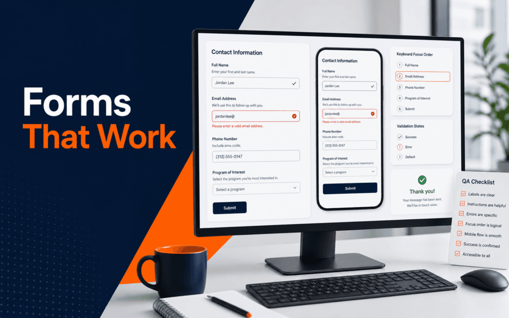
A website form UX checklist helps designers and developers find problems before enquiries, admissions requests, signups, or orders are lost. The practical check is simple: every field needs a clear label, useful instruction, readable error, sensible order, mobile-friendly spacing, keyboard access, and a confirmation path after submission. Use this checklist to diagnose and resolve the problem when a form exists but users hesitate, make mistakes, or cannot complete it.
Forms are small interfaces with high business value. A contact form, admissions form, checkout form, newsletter signup, or course enquiry form may be the point where a visitor becomes a lead. If the form is confusing, the site can look polished and still fail at the moment that matters.
Start With The Form Goal
Before reviewing labels or colors, define the form goal. A newsletter form, contact form, admissions form, login form, and payment form should not ask for the same information. The goal decides which fields are necessary, which fields are optional, and which fields should be removed.
Ask what the user is trying to finish. A course enquiry form may need name, contact detail, course interest, and message. It probably does not need a full address, employer name, or long biography at the first step. Every extra field adds effort and can reduce completion.
Write the form goal in one sentence. For example: this form helps a prospective student ask about a course and receive a response. That sentence makes review easier because any field that does not support the goal needs a clear reason.
The Web Design course connects to this work because form design is not only visual layout. It is user flow, content hierarchy, accessibility, and trust.
Use Clear Labels
The W3C Web Accessibility Initiative explains that labels should describe the purpose of form controls and be properly associated with them. A label tells users what information belongs in a field. It also helps assistive technologies communicate the field correctly.
Do not rely only on placeholder text. Placeholder text can disappear when the user starts typing, can be low contrast, and may not provide enough context. A visible label is usually clearer, especially on mobile and for longer forms.
Labels should be specific. Name is clearer than Details. Email address is clearer than Contact. Course of interest is clearer than Option. When a field has a required format, add instruction near the field rather than forcing users to guess.
Keep label wording consistent. If one field says Phone number and another says Contact no., the form feels less polished. Consistency reduces mental effort.
Provide Useful Instructions
W3C form instruction guidance says instructions should help users understand how to complete forms, including required input and formats. Instructions are useful when a field has rules, examples, or consequences.
Use instructions before errors happen. If a phone field needs country code, say so near the field. If a password needs a minimum length, show the requirement before the user submits. If a file upload accepts only certain formats, list the formats before the upload button.
Avoid long instruction paragraphs inside the form. Most users scan. A short note near the relevant field is better than a large block at the top that users forget before reaching the field.
Required and optional fields should be clear. Do not make users submit the form just to discover which fields were required.
Write Error Messages That Help
An error message should explain what went wrong and how to fix it. Email invalid is less helpful than Enter an email address like [email protected]. Required is less helpful than Enter your phone number so admissions can contact you.
Place errors near the field they affect. Also provide a summary when the form is long. Users should not have to hunt through a page to find the problem.
MDN explains that client-side form validation helps ensure entered data matches requirements before submission. This is useful for immediate feedback, but it should not be the only validation. Important forms still need server-side checks because client-side validation can be bypassed.
Error states should be visible beyond color. Use text, icons if helpful, and clear focus behavior. A red border alone may not be enough for users with low vision or color vision differences.
Check Mobile Flow
Mobile form UX needs careful testing. Fields should be large enough to tap, labels should remain visible, spacing should prevent accidental taps, and the keyboard should not hide the current field or submit button.
Test the form on a narrow viewport. Start at the first field, complete each field, trigger an error, correct the error, submit successfully, and read the confirmation. This full path matters more than a static screenshot.
Use the right input types where appropriate. Email fields, phone fields, number fields, and date fields can help browsers show more useful keyboards and validation behavior. Do not overuse specialized inputs if they make real user data harder to enter.
For development students, the Full Stack Web Development course is relevant because form usability also depends on validation, submission handling, email delivery, and backend safety.
Build Trust Before Submission
Forms ask users to give information. The page should explain why the information is needed and what happens next. A course enquiry form might say that the admissions team will respond with course details. A contact form might mention expected response flow without promising a specific time if that has not been verified.
Trust also comes from layout. Keep the form near relevant context, use clear headings, avoid unnecessary decoration around fields, and make the submit button label specific. Send is vague. Request Course Details or Submit Enquiry is clearer when it matches the action.
After submission, show a confirmation message that explains the next step. If the form sends email, confirm that the request was received. If the form creates an account, explain what the user can do next.
Final Form UX Checklist
Before publishing, confirm the form goal, field list, labels, instructions, required indicators, validation rules, error messages, keyboard order, mobile spacing, submit button label, loading state, success message, and notification path. Test the form with valid data and invalid data. Open the confirmation on mobile.
Also check analytics or event tracking only when it is configured responsibly. The SEO course is relevant because forms often support search-driven landing pages and conversion paths.
Common Form UX Mistakes
The first mistake is asking for too much information too early. Short forms are not always better, but every field needs a reason.
The second mistake is hiding labels inside placeholders. Visible labels make forms easier to scan and complete.
The third mistake is writing errors that blame the user. Error messages should guide correction.
The fourth mistake is testing only the success path. Production forms need invalid-input testing, mobile testing, and confirmation testing.
Form QA Handoff
When the form is ready, create a short QA handoff for the developer, marketer, or site owner. Include the form URL, form goal, required fields, optional fields, notification recipient, success message, and any tracking events that should be checked. This makes ownership clear.
Also include test cases. A basic form test should cover a valid submission, missing required field, invalid email address, long message, mobile viewport, keyboard navigation, and confirmation message. If files are uploaded, test accepted and rejected file types. If the form sends email, confirm that the email arrives and is readable.
Do not treat the design file as the final proof. The live form can behave differently because of browser validation, server validation, spam protection, SMTP settings, or plugin behavior. A form is only ready when the published page works.
For important forms, keep a recurring check. Admissions, contact, checkout, and enquiry forms should be tested after major updates, plugin changes, theme changes, or SMTP changes. A broken form can quietly block leads for days.
One useful beginner exercise is to review a form without touching the design first. Write down every hesitation a user might have: unclear field, missing instruction, weak button label, hidden error, cramped mobile spacing, or uncertain next step. Then group fixes into content, layout, validation, and technical delivery. This separates design problems from development problems and makes the fix easier to assign.
If the form supports a campaign, test it from the campaign link. A landing page can look correct, but the campaign path may include a tracking link, redirect, popup, or mobile browser that changes the experience. The real test is the path a visitor actually follows.
Students developing interface skills can use this checklist as a project review standard while exploring the UI/UX Design program. The strongest evidence is a form that remains understandable through errors, keyboard use, small screens, and final delivery.
Record the failed state as carefully as the successful one. A screenshot or test note showing the entered value, visible message, focus position, and server response makes the correction reproducible for both designers and developers.
Prospective students in Gujrat, Punjab, Pakistan can take this checklist into a conversation about the UI/UX Design. It creates specific questions about practice, feedback, testing, and project completion while avoiding assumptions about a particular batch.
FAQ
What makes a website form easy to use?
A form is easier to use when fields are necessary, labels are clear, instructions are visible, errors explain fixes, and the mobile flow is comfortable.
Should placeholder text replace labels?
No. Placeholder text can support an example, but visible labels are usually clearer and more accessible.
What should designers test before publishing a form?
Test labels, required fields, validation, errors, keyboard order, mobile spacing, submit behavior, success messages, and notification delivery.
Want to Build Practical Technology Skills?
Explore RisingEdge courses designed to help students learn real skills, build projects, and prepare for career opportunities.