Responsive Web Design QA Checklist: Layout, Content, Accessibility
A responsive web design QA checklist helps you find layout, content, and accessibility problems before users do. The practical check is to test real pages at mobile, tablet.


A responsive web design QA checklist helps you find layout, content, and accessibility problems before users do. The practical check is to test real pages at mobile, tablet, laptop, and wide desktop sizes; confirm navigation, text, images, forms, spacing, and actions; then verify accessibility basics such as keyboard use, contrast, labels, and readable content order. Use this checklist to diagnose and resolve the problem when a page looks fine on one screen but breaks on another.
MDN describes responsive web design as an approach that helps pages render well on different screen sizes and resolutions while maintaining usability. That is the goal of responsive QA: not only checking whether the page fits, but whether it still works for the reader.
Test Real Viewports, Not Only Device Names
Responsive QA should start with viewport ranges. Test narrow mobile, large mobile, tablet, laptop, and wide desktop. Device presets are useful, but they are not enough because real users have many screen sizes, zoom levels, browser settings, and device orientations.
Begin with the most important pages. For a course website, that may include the homepage, course detail pages, admissions page, contact page, blog article, and any form submission flow. Testing every page is ideal, but priority pages should never be skipped.
Resize slowly and watch for breakpoints where the design changes. A layout can look good at 390 pixels and 768 pixels but break at 520 pixels. Check the spaces between known breakpoints, not only the preset sizes.
Keep a simple QA note with page, viewport, issue, screenshot path if available, severity, and fix status. This turns responsive testing from random clicking into a repeatable process.
Check Layout Stability
Look for horizontal scrolling, overlapping elements, cropped cards, hidden buttons, broken grids, and content that jumps when images load. These are common responsive failures. A page should feel stable as the viewport changes.
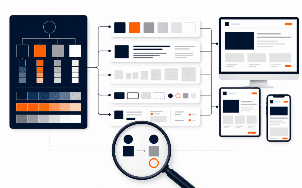
Media queries are one tool for responsive design. MDN explains that media queries allow CSS to apply different layouts based on viewport size and other environment conditions. During QA, verify that breakpoints actually support the content, not only the mockup.
Grid and card layouts need special attention. Cards should keep readable text, balanced spacing, and consistent buttons. If one card has a longer title, it should not push the whole layout into a broken shape. Test with real content, not perfect placeholder text.
The Web Design course connects directly to this work because responsive design is a practical craft. Designers and developers need to think about content behavior, not only static screen previews.
Review Text And Content Flow
Responsive design fails when text becomes hard to read. Check font size, line length, paragraph spacing, heading scale, and button labels. Text should not become tiny on mobile or oversized inside compact components.
Content order matters. On desktop, a two-column layout may place supporting content beside the main explanation. On mobile, that content may stack above or below. Make sure the mobile order still makes sense. A call to action should not appear before the context needed to understand it.
Images should support the content. Check that important parts of an image are not cropped at mobile sizes. Hero images should not hide the heading or push key content too far down the page. Decorative images should not delay the reader from reaching the main task.
Forms need careful reading. Labels, placeholder text, errors, help text, and success messages should remain visible and understandable. A form that technically submits but hides the error message on mobile is not production-ready.
Verify Navigation And Actions
Navigation is often where responsive issues appear. Test menus, dropdowns, accordions, tabs, filters, search, and footer links. Confirm that touch targets are easy to use and that menus can open and close without covering important actions.
Buttons should remain visible, readable, and tappable. Watch for button text wrapping awkwardly or icons losing meaning. If a button changes position between viewports, confirm the action is still easy to find.
Interactive components should work with content. A course filter may look good with three options but fail with twelve. A pricing card may look balanced with short labels but break with real descriptions. Test with the actual content that will be published.
For developers, responsive QA also connects to implementation. The Full Stack Web Development course is relevant when students need to understand how front-end code, layout systems, and real data work together.
Include Accessibility Basics
Responsive QA should include accessibility checks because usability changes across devices. The W3C WCAG Quick Reference provides guidance for accessibility success criteria and techniques. A beginner does not need to memorize everything at once, but they should build the habit of checking core issues.
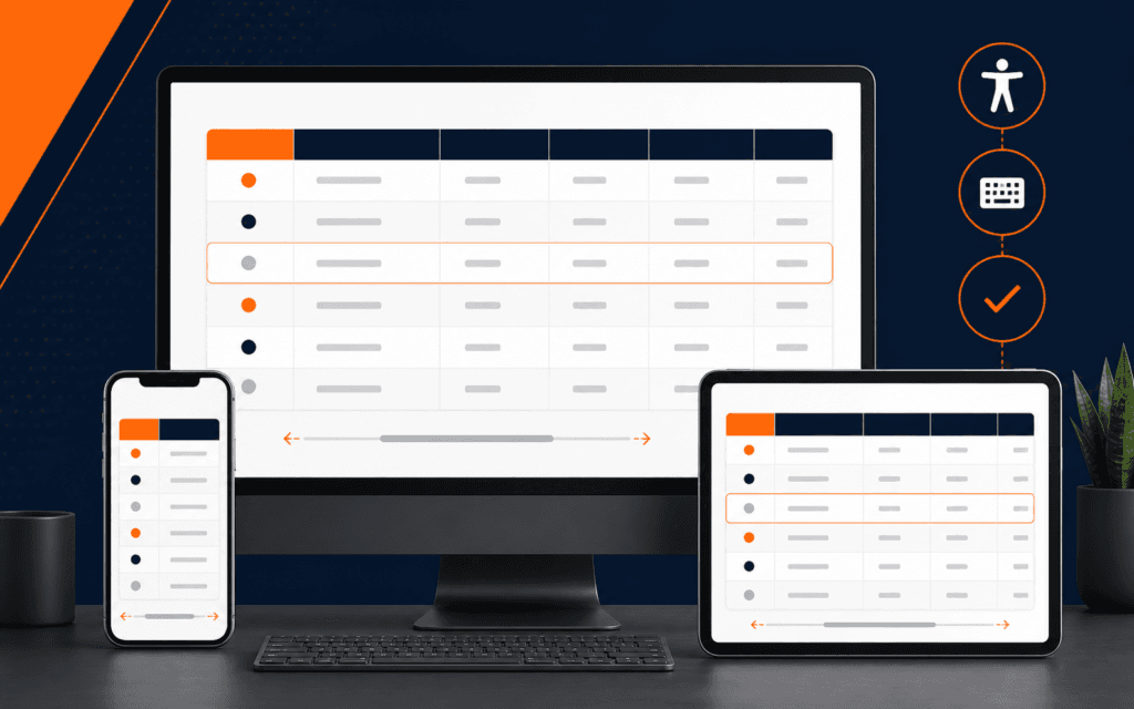
Test keyboard navigation. Can you reach links, menus, form fields, and buttons in a logical order? Is focus visible? Can a dropdown be opened and closed without a mouse? A responsive menu that only works with a pointer can block users.
Check contrast and readability. Text over images, orange accents, light grey labels, and disabled states can become hard to read on small screens. Do not rely on color alone to communicate meaning. Error messages should include clear text.
Check labels and names. Form fields should have labels, buttons should have meaningful text or accessible names, and image alt text should describe relevant content. These details help people using assistive technologies and also improve general clarity.
Test Performance And Loading Behavior
Responsive pages should load and settle cleanly. Watch how images, fonts, animations, and embedded content behave on slower connections or mobile devices. A page may pass visual QA after loading but still feel poor while loading.
Large images can create layout shifts or slow pages. Use appropriate image sizing and confirm that important content is not delayed behind heavy media. Animations should be subtle and should not hide content or make navigation harder.
Performance is not separate from design. A beautiful page that is slow, jumpy, or hard to interact with creates a weak user experience. Responsive QA should consider both appearance and behavior.
The SEO course is relevant because page experience, discoverability, content structure, and technical access all affect how useful a site is to visitors.
Common Responsive QA Mistakes
The first mistake is checking only one mobile preset. Real problems often appear between preset sizes.
The second mistake is testing with perfect sample content. Real headings, course names, prices, forms, and blog excerpts create different layout pressure.
The third mistake is ignoring accessibility until the end. Accessibility issues are easier to prevent during layout design than to repair after launch.
The fourth mistake is approving screenshots instead of workflows. A page must support reading, navigation, action, and recovery from errors.
Final Responsive Web Design QA Checklist
Before launch, test priority pages across viewport ranges. Check layout stability, text readability, content order, image cropping, navigation, touch targets, forms, keyboard access, focus states, contrast, alt text, loading behavior, and broken links. Record issues with severity and fix status. Retest after fixes.
Responsive review is not a one-time visual glance. It is a practical review of whether the design still helps the user on the device they actually use.
Prioritize fixes by user impact. A hidden submit button, unreadable form error, broken menu, or inaccessible keyboard path is more urgent than a small spacing mismatch. Visual polish matters, but production QA should first protect the tasks that let users read, navigate, contact, apply, buy, or learn.
Retest after every responsive fix. CSS changes can repair one viewport and damage another. After changing a grid, button, menu, or media query, test the affected component again across the same viewport range. Keep the final QA note short, but make it specific enough that another person can understand what was checked.
A good issue note includes the page URL, viewport width, browser, expected behavior, actual behavior, severity, and fix owner. This makes the issue actionable for designers and developers. It also prevents vague feedback such as mobile looks wrong, which is hard to reproduce and easy to misunderstand.
When time is limited, test the conversion path first. For a course site, that means moving from a course page to admissions or contact without layout, navigation, or form problems. Supporting pages still matter, but the highest-value workflow should be stable before launch.
Finish by checking the page with real browser zoom settings. Some visitors use zoom for readability, and responsive layouts should not collapse when text becomes larger. This is a simple way to catch rigid containers and crowded navigation.
Repeat the final check at narrow, medium, and wide widths with real content. A layout that survives placeholder text can still fail when headings wrap, validation appears, or navigation labels become longer.
Students considering the Web Design and Front-End Development can practise this checklist from Gujrat or through live online classes across Pakistan. This makes the course decision more concrete because the learner can evaluate the subject through an actual workflow instead of a broad description.
FAQ
What is responsive web design QA?
Responsive web design QA is the process of testing whether pages remain usable, readable, accessible, and visually stable across different screen sizes and devices.
Which screen sizes should beginners test?
Test small mobile, large mobile, tablet, laptop, and wide desktop sizes. Also resize between breakpoints to find issues presets may miss.
Should accessibility be part of responsive QA?
Yes. Keyboard navigation, contrast, labels, focus states, and readable content order are essential parts of responsive usability.
Want to Build Practical Technology Skills?
Explore RisingEdge courses designed to help students learn real skills, build projects, and prepare for career opportunities.