Graphic Design Portfolio Checklist: What Beginners Should Show First
A beginner graphic design portfolio should show a small number of strong projects, clear visual thinking, short case-study context, clean presentation, and enough process to prove.

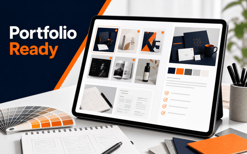
A beginner graphic design portfolio should show a small number of strong projects, clear visual thinking, short case-study context, clean presentation, and enough process to prove that the designer can solve a real communication problem. It should not be a folder of every poster, logo, social post, and class exercise the student has ever made.
Adobe’s graphic design portfolio guidance highlights portfolio ideas such as curating strong work, including case studies, choosing a platform, and proofreading before publishing. Adobe Express also describes portfolio creation as a process of choosing a template or starting from scratch, then customizing text, style, and content. For Rising Edge learners, Graphic Design connects naturally with Web Design because a portfolio is both a design proof and a web presentation problem.
Start With Five to Seven Strong Projects
The first portfolio decision is what to leave out. Beginners often think a larger portfolio looks more experienced, but weak or random work can make the whole presentation less credible. A focused set of five to seven projects is easier to review and easier to improve.
Choose work that shows range without becoming scattered. A beginner portfolio might include a brand identity project, social media campaign, poster or flyer, packaging concept, website mockup, typography exercise, and one personal or class project with a clear brief. The exact mix depends on the designer’s goals.
Do not include a project only because it took a long time. Include it because it shows useful thinking, strong craft, or a relevant skill. A simple layout with clear hierarchy may be stronger than a complicated piece with too many colors, effects, and typefaces.
Students should also remove duplicates. Three logo projects with the same style teach less than one logo project, one editorial layout, and one campaign system. Variety matters when it reveals different decisions, not when it becomes visual noise.
Give Each Project a Short Case Study
A portfolio project needs context. The viewer should understand the brief, audience, problem, role, process, and final outcome. This does not require a long essay. A short case study can be more effective than a dense paragraph.
Use this structure:
- Project goal: what the design needed to achieve.
- Audience: who the design was for.
- Role: what the student personally created.
- Process: key research, sketching, layout, or revision decisions.
- Final result: what changed from idea to finished work.
This structure helps a beginner sound professional without inflating the project. It also prevents a common portfolio weakness: showing an attractive image with no explanation of the decision behind it.
For class projects, be honest about the scope. If the project was fictional, say it was a student concept. If the project used a template, explain what was customized. Credibility matters more than pretending every project was a client campaign.
Show Process Without Overloading the Page
Process is useful when it explains how the final design became stronger. It is not useful when it becomes a messy dump of every sketch, screenshot, or rejected idea.
Good process evidence includes mood boards, rough sketches, typography tests, color exploration, layout iterations, and before-and-after comparisons. Pick only the process pieces that support the story. If a sketch shows the first useful idea, include it. If a screenshot only proves that software was opened, leave it out.
Beginners should use captions carefully. A caption can explain why a choice matters: “Early layout exploration focused on stronger product hierarchy.” That is better than a vague caption like “Process work.” The viewer should learn what decision was made.
Process also helps separate design from decoration. A portfolio that only shows finished images may look polished, but a portfolio that shows thoughtful decisions feels more trustworthy.
Make the Visual Presentation Quiet and Clear
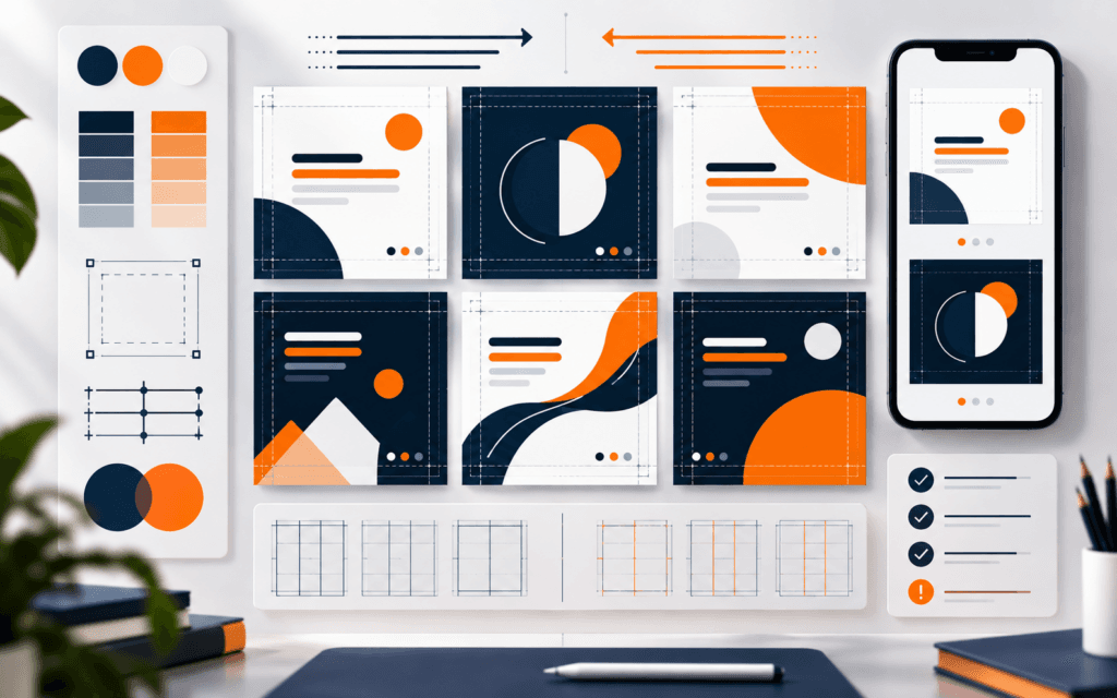
The portfolio design should support the work. It should not compete with it. Adobe’s beginner design guidance warns against cramming too many design elements into one project and encourages limiting choices such as colors, typefaces, and images. That advice applies strongly to portfolio pages.
Use consistent spacing, readable typography, simple navigation, and clean image sizing. Avoid heavy backgrounds, too many animations, low contrast text, and decorative elements that distract from the projects. If the portfolio website is hard to read, the viewer may question the designer’s judgment.
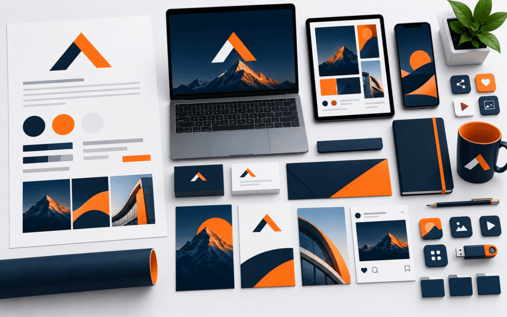
Image quality matters. Export work at a size that looks sharp but loads reasonably. Crop intentionally. Show mockups only when they clarify real usage. A logo on a dramatic mockup can look impressive, but the portfolio should also show the mark clearly on a plain background.
For web presentation, test the portfolio on mobile. Many people will open a link from a phone. Project images, captions, and navigation should still work without pinching and zooming.
Match the Portfolio to the Goal
A portfolio for freelance clients should answer different questions than a portfolio for a design internship. A client wants to know whether the designer can solve a business communication problem. A hiring reviewer wants to know whether the student has visual judgment, process discipline, and software readiness.
Before publishing, choose the primary goal:
- Freelance clients.
- Internship or junior job.
- Course admission or scholarship.
- Personal brand.
- Practice and feedback.
Then adjust project order and descriptions around that goal. A freelance-focused portfolio should lead with practical client-like work. A junior job portfolio should show process and teachability. A personal brand portfolio can show more personality, but it still needs clarity.
For Rising Edge students, the Graphic Design course can support project creation, while Web Design helps turn that work into a clear online presentation.
Beginner Portfolio Checklist
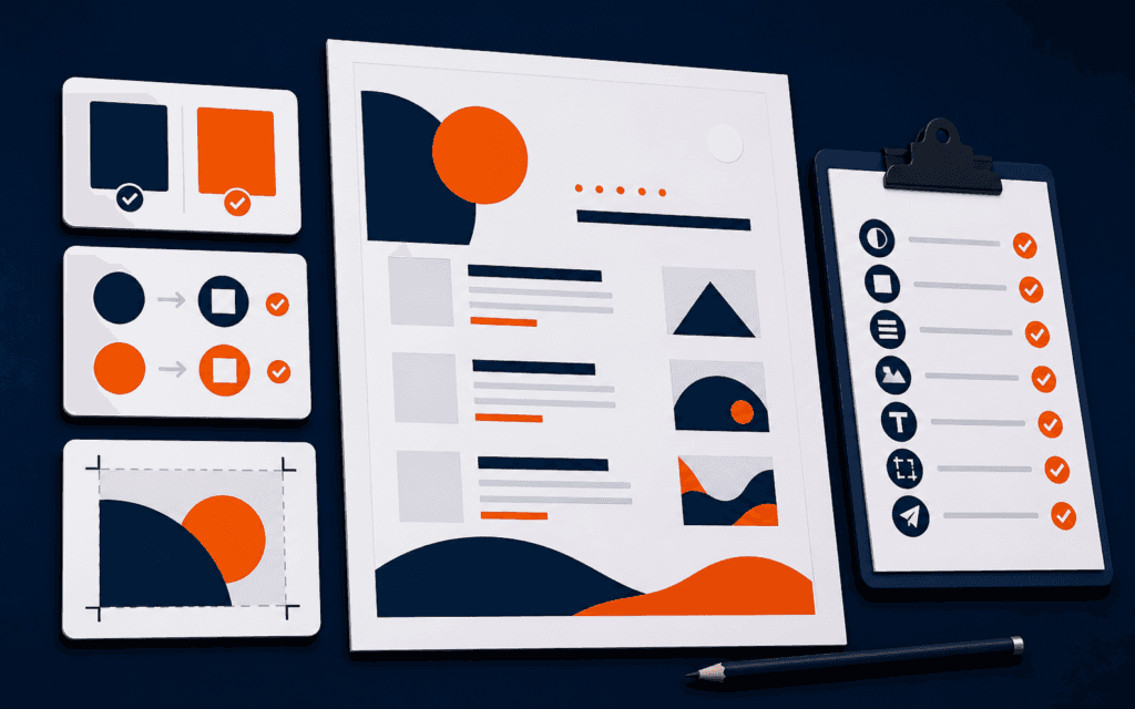
Use this checklist before sharing the portfolio:
- Five to seven strong projects are selected.
- Weak or duplicate pieces are removed.
- Each project has a clear goal and audience.
- The student’s role is honest and specific.
- Process images explain useful decisions.
- Final visuals are sharp and consistently sized.
- Captions are short and helpful.
- Navigation is simple on desktop and mobile.
- Contact or next-step information is easy to find.
- Spelling, grammar, links, and image loading are checked.
This checklist keeps the portfolio practical. It helps beginners prepare for feedback, interviews, clients, or class review without turning the page into a design museum.
Common Mistakes Beginners Make
The first mistake is showing too much work. A portfolio is curated proof, not storage.
The second mistake is using mockups to hide weak design. Mockups should support the work, not replace it.
The third mistake is skipping project context. Viewers need to know what problem the design solved.
The fourth mistake is using an overdesigned portfolio template. The presentation should feel polished, but the projects should remain the focus.
The fifth mistake is publishing before proofreading. A typo in a portfolio can weaken trust quickly.
How to Review a Portfolio Before Publishing
Before sharing a portfolio link, review it like someone who has only three minutes. Open the homepage, scan the first project, read one case study, check the contact path, and view it on a phone. If the strongest work is hard to find, the portfolio needs editing.
A useful review starts with project order. Put the most relevant and polished project first. Do not hide the strongest work behind a long introduction, decorative animation, or a category page that requires extra clicks. The viewer should understand the designer’s direction quickly.
Next, review the case-study writing. Each project should explain the brief, audience, role, and result in plain language. Replace vague phrases like “modern design” with specific decisions such as “larger type scale for faster event scanning” or “limited color palette to keep the campaign easy to recognize.”
Finally, check the technical basics. Images should load, links should work, contact details should be current, and mobile spacing should not crop important visuals. Portfolio polish is not only visual style. It is the feeling that the designer pays attention to the whole experience.
What Feedback to Ask For
Beginners get better feedback when they ask focused questions. Instead of asking “Is my portfolio good?”, ask whether the project order is clear, whether the case studies explain the designer’s role, whether any project feels weaker than the others, and whether the contact path is obvious.
Ask one design-focused person and one non-designer. The designer may notice hierarchy, typography, composition, and process gaps. The non-designer may notice confusing wording, missing context, or unclear navigation. Both perspectives are useful.
After feedback, do not change everything at once. Fix the repeated issues first. If three people say the portfolio has too many projects, curate. If two people cannot understand the project goals, rewrite case studies. If mobile viewing is awkward, adjust layout before adding more visuals.
The goal is not to make the portfolio perfect forever. The goal is to make it strong enough to represent the current skill level honestly and clearly.
For learners in Gujrat, Punjab, Pakistan, this checklist provides a practical benchmark when exploring the Graphic Design. It helps prospective students ask about project work, feedback, and current requirements without relying on broad promotional claims.
FAQ
How many projects should a beginner graphic design portfolio include?
Five to seven strong projects are usually enough for a beginner portfolio. Quality, range, and clear explanation matter more than volume.
Should student projects be labeled as student work?
Yes. Honest labeling builds trust. A strong student concept is better than a project that pretends to be client work.
Does a graphic design portfolio need a custom website?
Not always. Beginners can use a portfolio builder, template, or custom site as long as the presentation is clean, accessible, mobile-friendly, and focused on the work.
Next Step
Pick your ten best pieces, then cut the list to the strongest five. Write a short case-study paragraph for each one. That first editing pass will usually improve the portfolio more than adding another project.
Want to Build Practical Technology Skills?
Explore RisingEdge courses designed to help students learn real skills, build projects, and prepare for career opportunities.