Design Review Checklist: Fix Hierarchy, Type, and Contrast
The most common graphic design mistakes beginners should fix before publishing are unclear hierarchy, weak typography, low contrast, crowded spacing, inconsistent colors, poor.

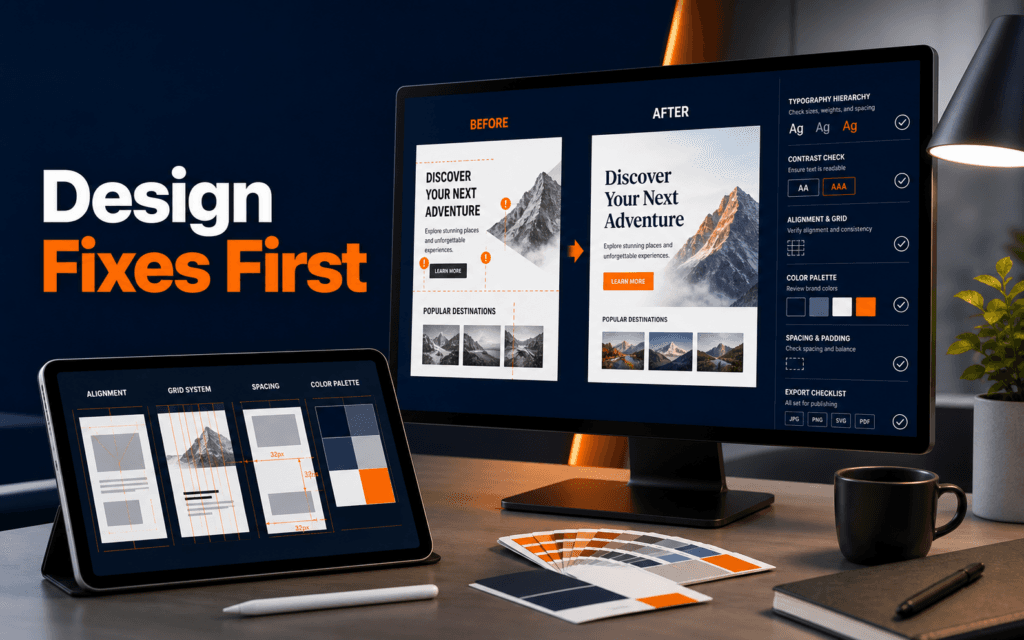
The most common graphic design mistakes beginners should fix before publishing are unclear hierarchy, weak typography, low contrast, crowded spacing, inconsistent colors, poor alignment, oversized decoration, and missing export checks. A design does not need to be complex to look professional. It needs to make the main message obvious, guide the eye, and remain readable wherever it appears.
Beginners often judge a design by how much is happening on the canvas. Professionals judge it by how quickly the audience understands what matters. That difference changes the whole workflow. Instead of adding more effects, a beginner should learn to remove confusion.
Mistake 1: No Clear Visual Hierarchy
Visual hierarchy means the viewer can tell what to read first, second, and third. If every element has the same size, weight, color, and spacing, the design forces the audience to work too hard. A poster, social media graphic, flyer, website banner, and presentation slide all need a clear order.
Start by identifying the one thing the viewer must notice first. That may be a course name, offer, event date, product name, or main promise. Make that element visibly stronger through size, weight, placement, contrast, or whitespace. Then support it with secondary information. Do not make the logo, headline, image, price, date, and call to action all compete at the same strength.
A useful beginner test is the three-second test. Look at the design for three seconds, then look away and name the main message from memory. If that is difficult, hierarchy is weak. Fix hierarchy before changing colors or adding effects.
Mistake 2: Too Many Fonts
Typography is not only decoration. Adobe’s typography guidance emphasizes that type choices affect readability, hierarchy, and how information is perceived. Beginners often use too many fonts because each section feels like it needs a different personality. The result usually looks inconsistent and harder to read.
Most beginner designs should use one font family or two carefully paired fonts. Use size, weight, and spacing to create variation before adding another typeface. A bold heading, regular body text, and smaller label can all come from the same family and still feel organized.
Font pairing works when contrast has a purpose. A strong heading font can pair with a readable body font, but both should support the same design direction. If the fonts feel like they belong to different brands, the design will look accidental.
Before sending the design out, check line length and line spacing. Text that is too wide becomes tiring. Text that is too tight feels crowded. Text that is too decorative may look interesting but fail at communication. In client or business work, readability wins.
Mistake 3: Weak Contrast
Low contrast is one of the fastest ways to make a design look unprofessional. It also affects accessibility. Pale text on a pale background, thin text over a busy image, or orange text on a similar warm color may look stylish on a large monitor but fail on a phone.
Contrast should support both hierarchy and readability. The most important text needs enough separation from the background. Buttons and calls to action should be visually distinct. Supporting details can be quieter, but they should not disappear.
Beginners should check contrast at thumbnail size. Zoom out or view the design on a phone. If the message fades, simplify the background, darken the overlay, increase text weight, or choose a cleaner image. Do not rely on the viewer’s patience.
The same rule applies to brand work. A brand color is useful only when it supports the design. If a color combination hurts readability, adjust the layout or color usage instead of forcing the palette everywhere.
Mistake 4: Crowded Spacing
Crowded designs usually come from fear. Beginners worry that empty space looks unfinished, so they fill every corner. In practice, whitespace is what lets the viewer understand the design. Space separates groups, highlights the main message, and makes the layout feel intentional.
Check spacing at three levels. First, review the outer margin so important elements do not sit too close to the edge. Second, review group spacing so related items stay close and unrelated items have separation. Third, review text spacing so lines, headings, and paragraphs remain comfortable to read.
A clean layout does not mean empty. It means the canvas has breathing room and the information is grouped logically. If the design feels crowded, remove one element before making everything smaller. Tiny text is rarely the answer.
This is especially important for social graphics and website banners. People see them quickly, often on mobile. A crowded design may contain more information, but it communicates less.
Mistake 5: Poor Alignment
Alignment is the invisible structure that makes a design feel controlled. When text boxes, images, icons, and buttons sit at random positions, the design feels amateur even if the colors are attractive. Beginners often move elements by eye without checking whether edges, centers, and spacing line up.
Use a simple grid. Align left edges, top edges, baselines, or centers based on the layout. If two elements are related, their placement should show that relationship. If an element intentionally breaks alignment, it should create emphasis, not confusion.
During review, scan the design from top to bottom and left to right. Look for elements that almost align but not quite. Those small errors are visible to viewers even when they cannot name the problem.
Alignment also improves speed. Once you define a grid, decisions become easier. You stop dragging elements randomly and start placing them with purpose.
Mistake 6: Inconsistent Colors And Effects
Beginners often use too many colors, shadows, gradients, outlines, and effects in one design. Each effect may look acceptable alone, but together they create noise. A professional design usually has a limited palette, clear contrast, and a restrained set of treatments.
Choose a primary color, a support color, a neutral background, and clear text colors. Use extra colors only when they carry meaning, such as status, category, or emphasis. If every element uses a different color for attention, nothing receives attention.
Effects should solve a problem. A shadow can separate a card from a background. A gradient can create depth. An outline can define a button. But effects should not be used only because the design feels empty. Fix hierarchy, spacing, and image choice first.
For students in the Graphic Design course, this is one of the most useful habits to build early: make the design clear before making it decorative.
Mistake 7: Using Images Without A Job
Images should support the message. A random stock photo, unrelated icon, or decorative background can make the design feel generic. Before using an image, define its job: show the product, explain the service, add context, create trust, or support the headline.
If the image does not help, remove it or replace it. A clean type-led design may work better than a weak image-led design. When images are needed, crop them intentionally. Avoid cutting off important details, covering faces with text, or placing text on busy areas.
For website and social work, image quality also affects trust. Blurry images, stretched logos, inconsistent icon styles, and low-resolution exports weaken the whole design. Always check the final export, not only the editing canvas.
Mistake 8: Ignoring The Final Placement
A design is not finished until it works where it will be used. A flyer, Instagram post, LinkedIn banner, website hero, thumbnail, presentation slide, and printed poster all have different constraints. Beginners often design in one view and forget the final placement.
Before final export, test the design at real size. View a social post on a phone. Preview a web banner in the page layout. Check a presentation slide in slideshow mode. Print a small sample if the design is for print. The goal is to catch problems before the audience sees them.
Export settings matter too. Use the right file type, dimensions, color mode when required, and compression level. A design can look good in the editor and still fail if exported too small or too compressed.
Students who also care about websites can connect these checks with the Web Design course, because the same fundamentals apply: hierarchy, spacing, contrast, alignment, and responsive readability.
A Simple Pre-Publish Design Review
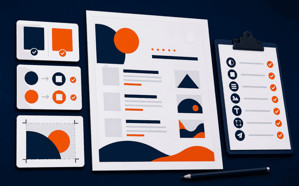
Use this review before sending any beginner design to a client, teacher, or public channel. First, name the main message. Second, check whether that message is the strongest element. Third, reduce fonts to one or two. Fourth, test contrast at thumbnail size. Fifth, clean up spacing and alignment. Sixth, remove decorations that do not support the message. Seventh, check images for quality and relevance. Eighth, preview the final format. Ninth, export with the correct size and file type.
This checklist is simple, but it changes the quality of beginner work quickly. It also teaches a professional mindset. Design is not the act of filling a blank canvas. It is the act of making communication easier for a real audience.
This topic also has a local training use for students in Gujrat, Punjab, Pakistan: this checklist can be compared with practical exercises in the Graphic Design. Confirm current batch requirements directly and judge the learning path by inspectable work.
FAQ
What is the biggest graphic design mistake beginners make?
The biggest mistake is unclear hierarchy. If viewers cannot tell what to read first, the design fails even if the colors and images look attractive.
How many fonts should a beginner use in one design?
Use one font family or two paired fonts in most beginner projects. Create variety with size, weight, and spacing before adding more typefaces.
What should I check before publishing a design?
Check hierarchy, typography, contrast, spacing, alignment, colors, image quality, final placement, and export settings. Preview the design at the size where the audience will see it.
Want to Build Practical Technology Skills?
Explore RisingEdge courses designed to help students learn real skills, build projects, and prepare for career opportunities.