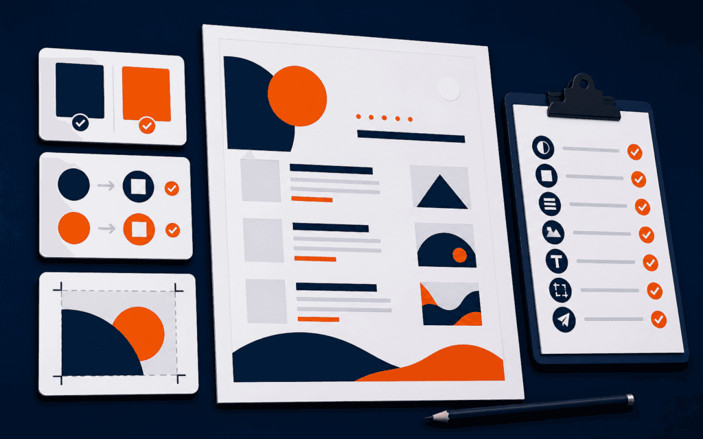
Accessible Graphic Design Checklist: Contrast, Meaning, Text.
An accessible digital graphic makes its important message perceivable without depending on one color, tiny text, a fragile crop, or unexplained imagery. Start by naming the.
RisingEdge Resources
Read Graphic Design articles, practical guides, and technology learning resources from RisingEdge.

5+
Articles
Practical Guides
17+
Topics
Technology Skills
Updated
Regularly
Fresh Content
Featured Resource

An accessible digital graphic makes its important message perceivable without depending on one color, tiny text, a fragile crop, or unexplained imagery. Start by naming the.
100%
Free Resources
For All Learners
Fresh learning resources, practical guides, and technology insights from RisingEdge.

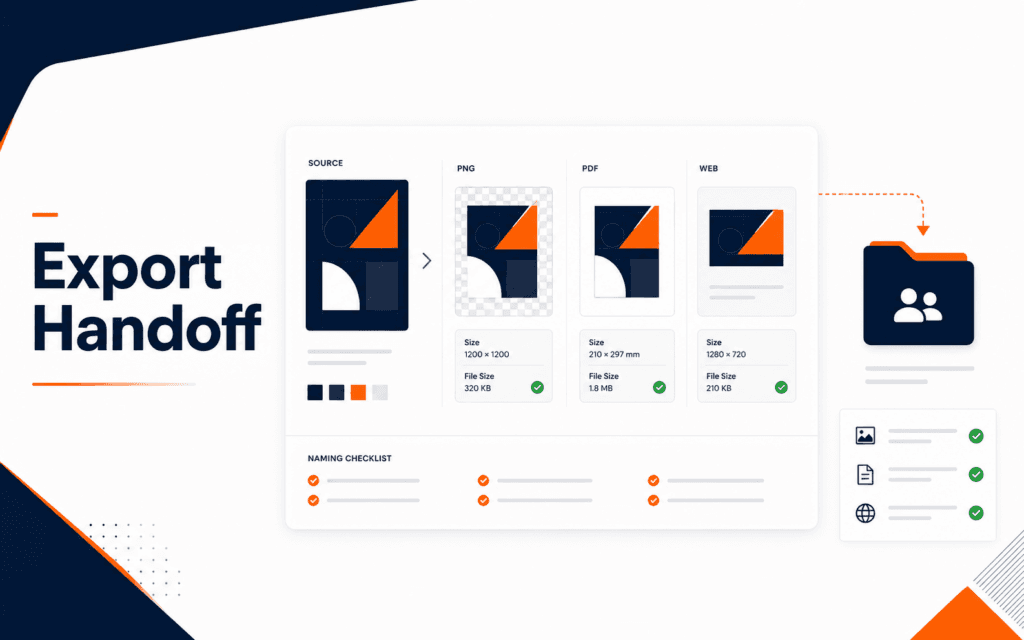
Graphic design export settings decide whether a good design stays usable after it leaves the design tool. The practical workflow is to identify the final placement, choose the.
Get practical learning resources, course updates, and technology insights delivered straight to your inbox.
No spam. Unsubscribe anytime.
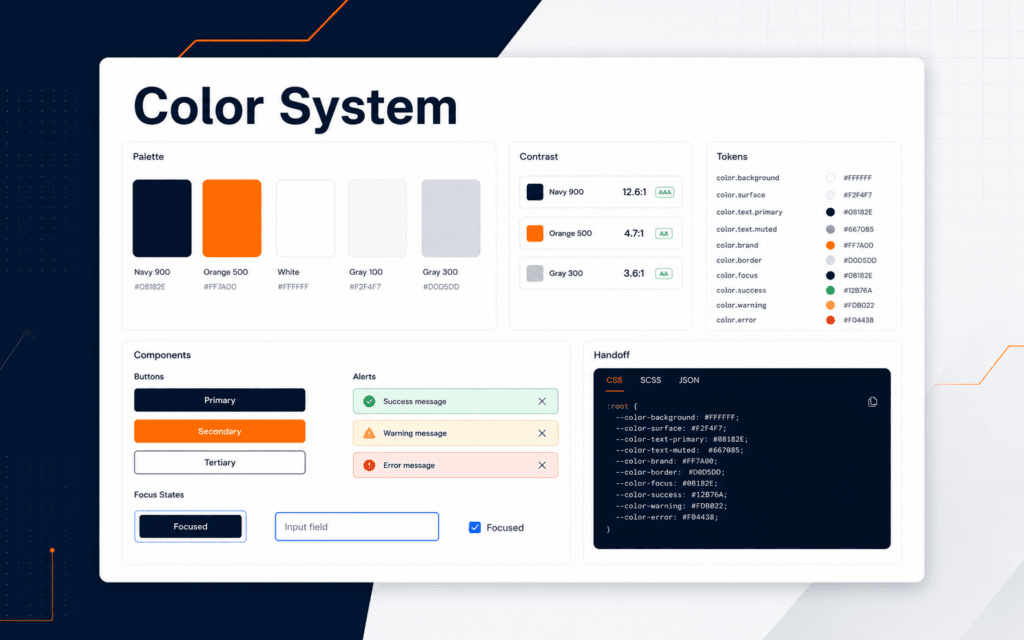
A brand color system checklist helps designers move from attractive palettes to colors that can be used consistently in real projects. The practical workflow is to define core.

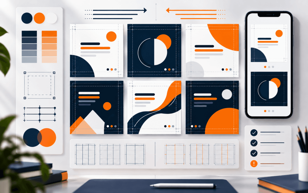
The most common graphic design mistakes beginners should fix before publishing are unclear hierarchy, weak typography, low contrast, crowded spacing, inconsistent colors, poor.

A beginner graphic design portfolio should show a small number of strong projects, clear visual thinking, short case-study context, clean presentation, and enough process to prove.
Explore practical RisingEdge courses designed to help students learn, build projects, and prepare for career opportunities.