Graphic Design Export Settings: PNG, PDF, Web Handoff
Graphic design export settings decide whether a good design stays usable after it leaves the design tool. The practical workflow is to identify the final placement, choose the.

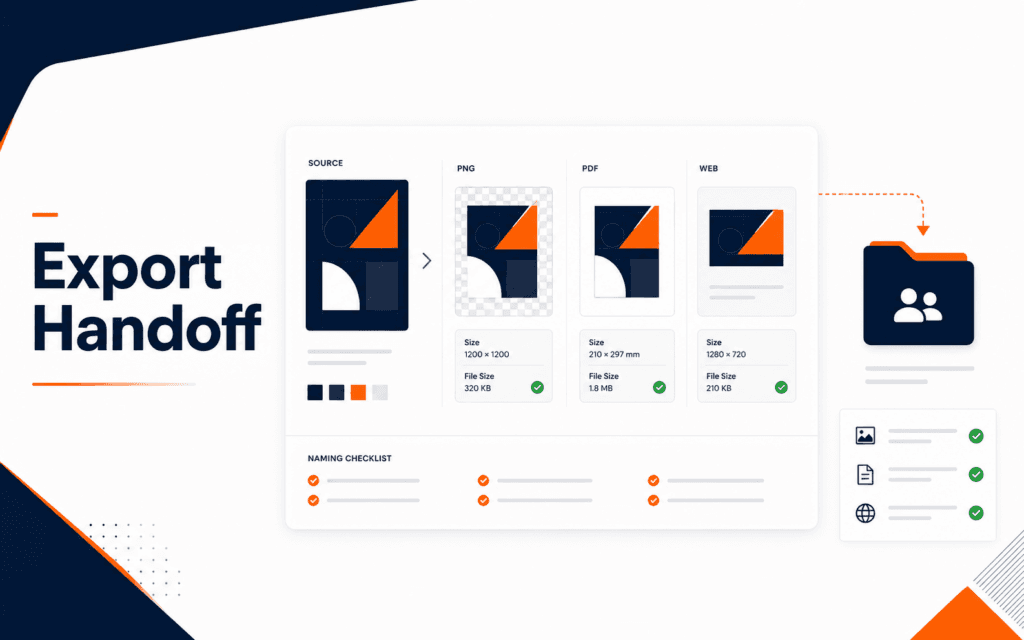
Graphic design export settings decide whether a good design stays usable after it leaves the design tool. The practical workflow is to identify the final placement, choose the right file type, export at the correct size, preserve transparency only when needed, prepare print files separately from web files, compress web images carefully, name files clearly, and include a short handoff note. A design can look finished on the canvas and still fail when it is uploaded, printed, shared, or handed to a developer.
Canva’s help documentation separates download file types such as PNG, JPG, and PDF for different needs. MDN lists common image media types such as JPEG, PNG, and SVG. Google documents WebP as a modern image format for the web. The lesson for beginners is simple: export choices are production decisions, not random save options.
Start With The Final Placement
Before exporting, write where the design will be used. A website hero, blog thumbnail, Instagram post, printed flyer, certificate, presentation slide, logo file, and email banner all have different constraints. The same artwork may need more than one export.
Ask three questions: where will it appear, what size will it appear at, and who will use the file next. A developer needs a different handoff than a printer. A social media manager needs a different file than a teacher preparing slides.
The Graphic Design course connects to this because export quality is part of professional design, not an afterthought.
Choose PNG For Sharp Graphics
PNG is often useful for graphics, interface mockups, transparent elements, diagrams, and images with crisp edges. Canva notes PNG as one of its design download file types, and it is commonly used when clarity or transparency matters.
Use PNG when the design includes flat color, screenshots, icons, or text that needs to stay sharp. Avoid using a huge PNG for every web photo. Large files can slow down pages and make the design harder to use online.
If transparency is needed, confirm that the exported PNG actually preserves it. Then test the file on a light background and dark background. Transparent edges can look rough if the original design had hidden shadows or low-quality cutouts.
Use JPG For Photos When Transparency Is Not Needed
JPG is usually practical for photographs and image-heavy designs that do not require transparency. It often produces smaller files than PNG for photo content, but compression can create visible artifacts if pushed too far.
Export a sample and zoom in. Check faces, product edges, gradients, and text areas. If text becomes blurry, the file type, size, or compression setting may be wrong.
JPG is not ideal for logos with transparency or graphics that need crisp edges. Beginners often export everything as JPG because it is familiar. That habit can damage design quality when the file needs transparency, sharp UI text, or later editing.
Prepare PDF For Print And Documents
PDF is usually the safer handoff for printable documents, certificates, brochures, forms, and multi-page material. Canva documents PDF as a download option, and PDF workflows are common because they preserve page structure better than a flat screenshot.
Print files need different checks from web files. Confirm page size, bleed if required, margins, image quality, color expectations, and whether fonts or vector elements survive correctly. If a printer provides specifications, follow those specifications rather than guessing.
For a client or team handoff, include both the editable source link or file and the final PDF when appropriate. The PDF shows what should be produced. The source file allows future edits.
Use SVG Carefully For Simple Vector Assets
SVG can be useful for simple logos, icons, and vector illustrations on websites. MDN lists image/svg+xml as a common image media type. SVG can scale cleanly, which makes it valuable for responsive web design.
However, SVG is not automatically the right choice for every design. Complex artwork, embedded photos, unusual effects, or unsafe copied code can create problems. If the file will be used on a website, a developer should review it before production.
The Web Design course is relevant because web assets must balance clarity, file size, responsiveness, accessibility, and browser behavior.
Consider WebP For Website Images
Google describes WebP as a modern image format for the web with lossy and lossless compression and transparency support. For many website images, WebP can reduce file size while keeping acceptable quality.
Use WebP when the publishing workflow supports it and the site has a reasonable fallback or image pipeline. Do not send only a WebP file to someone who asked for a print-ready PDF or an editable design source.
When exporting for a website, check the final rendered image in the browser. A file can look good locally but appear too soft, too large, cropped poorly, or slow on the actual page.
Export At The Right Size
Export size should match the use case. A 1600 pixel blog image, a 1080 square social post, a 1920 hero image, and a print flyer are not interchangeable. Oversized files waste bandwidth. Undersized files look blurry.
Keep the source design larger and export the required sizes from it. Avoid repeatedly resizing already compressed images because quality degrades.
For thumbnails, preview the image small. Text that looks readable at full size may fail at thumbnail size. If the export is for a website card, upload it to a test page and inspect the real layout.
Check Color And Background Context
Exported colors can look different when the file moves from the design tool to a website, phone screen, projector, or printed page. Before delivery, preview the design in the place where the audience will see it. A navy background may look rich on the canvas but too dark on a low-quality screen. A pale grey border may disappear on a white page.
Transparent files need background checks. Place the PNG or SVG over white, navy, grey, and any expected website section color. Look for rough edges, invisible shadows, accidental white boxes, and text that loses contrast.
For print, confirm whether the printer expects a specific color profile or PDF preset. Beginners should not guess when a vendor gives instructions. Following the supplied print requirements is usually safer than exporting the prettiest screen preview.
Keep Editable Sources Separate
Final exports are not the same as source files. A PNG, JPG, or flattened PDF may be perfect for publishing but poor for future editing. Keep the editable Canva, Illustrator, Photoshop, Figma, or other source file separate from delivery exports.
This protects the workflow. The marketing team can publish the final asset while the designer keeps a clean source for later changes. If a phone number, course title, date, or logo placement changes, the team can update the source instead of rebuilding from a compressed image.
Also separate approved brand assets from working experiments. A folder with official logos, final exports, and old drafts mixed together invites mistakes.
Name Files Clearly
File names should tell the next person what the asset is. Use descriptive names such as rising-edge-course-hero-1600×1000.png instead of final-final-new2.png. Include size or placement when useful.
Keep names lowercase, simple, and web-safe when the file will be uploaded to a site. Avoid spaces, random punctuation, and unclear abbreviations. Clear names help developers, marketers, and future designers find the correct asset.
Also keep version notes outside the filename when possible. A short handoff note or folder structure is easier to understand than a file name packed with every detail.
Build A Handoff Folder
A clean handoff folder can include source file or edit link, final PNG or JPG exports, PDF when needed, SVG icons or logos if approved, a web image version, and a short notes file. The notes file should explain placement, dimensions, file types, and any constraints.
Mention what should not be edited. If a logo, brand color, or official course graphic must stay unchanged, say so clearly. Handoff is not only about sending files. It is about preventing wrong assumptions.
The Digital Marketing course connects when exported designs are used in campaigns, ads, landing pages, email graphics, and social posts where file size and placement affect results.
Final Export Review
Before delivery, open every exported file. Check size, crop, sharpness, transparency, color, spelling, margins, file type, and filename. Test web files on the intended page or screen size. Test print files against the printer or document requirements.
This final review is small but important. Many design mistakes happen after the creative work is done because nobody checked the exported asset.
Learners in Gujrat, Punjab, Pakistan can use this workflow as a small practice standard before choosing the Graphic Design. Completing and explaining the work gives a clearer signal of subject fit than course terminology by itself.
FAQ
What export format should beginners use for graphics?
Use PNG for sharp graphics or transparency, JPG for photos without transparency, PDF for print or documents, and SVG only for suitable vector assets.
Is WebP good for website images?
Yes, WebP can be useful for web images when the site supports it and the image is tested in the real page layout.
What should a design handoff include?
Include the source file or edit link, final exports, needed sizes, file type notes, usage instructions, and any brand constraints.
Want to Build Practical Technology Skills?
Explore RisingEdge courses designed to help students learn real skills, build projects, and prepare for career opportunities.