Brand Color System Checklist: Contrast, Tokens, Handoff
A brand color system checklist helps designers move from attractive palettes to colors that can be used consistently in real projects. The practical workflow is to define core.

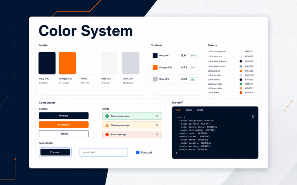
A brand color system checklist helps designers move from attractive palettes to colors that can be used consistently in real projects. The practical workflow is to define core colors, assign usage roles, check contrast, avoid using color alone for meaning, name tokens clearly, document examples, and hand off values that developers can implement. Use this checklist to diagnose and resolve the problem when a brand looks good in a mockup but becomes inconsistent across website pages, social graphics, dashboards, and course assets.
Color systems matter because color decisions repeat. A brand may use a navy background, orange accent, white surface, grey border, success color, warning color, and muted text color many times. If those choices are not named and tested, every designer and developer starts guessing.
Start With Color Roles
Begin by naming what each color does. Primary color, accent color, page background, card background, text color, muted text, border, success, warning, danger, and link are roles. A color without a role is only a swatch.
Roles make decisions easier. If orange is the accent color, it can highlight buttons, active states, charts, and small emphasis. If navy is the primary foundation, it can support headers, dark panels, and brand areas. If grey is a border color, it should not suddenly become body text.
Write the role beside each color. Include hex value, common use, avoid use, and example components. This prevents a palette from becoming a decorative mood board instead of a working system.
The Graphic Design course connects to this workflow because professional design is not only choosing good colors. It is making colors repeatable and usable.
Check Text Contrast
W3C contrast guidance explains that minimum luminance contrast between text and background can make text more readable for people with low vision or color vision deficiency. Designers should treat contrast as a production check, not a final decoration.
Check normal body text, small labels, button text, navigation text, disabled text, captions, form hints, and text placed over images. A color pair that works for a large heading may fail for small body copy.
Do not rely on visual confidence alone. Use a contrast checker during design and again after development. Shadows, gradients, opacity, overlays, and image backgrounds can change the real contrast.
Keep approved pairings in the system. For example, navy with white text may be approved, orange with navy text may be approved, and light grey with muted text may require care. Pairing notes save time later.
Do Not Use Color Alone
W3C use-of-color guidance says color should not be the only visual means of conveying information when color has assigned meaning. This affects forms, charts, buttons, alerts, dashboards, and course progress indicators.
If an error is shown only in red, some users may miss it. Add text, an icon when helpful, and clear placement. If a chart uses only color to distinguish categories, add labels, patterns, or direct legends. If a selected tab uses only orange text, add an underline or active state shape.
Color can still communicate strongly. The rule is not to avoid color. The rule is to avoid making color the only way to understand the state or meaning.
This matters for brand design because accessibility and brand consistency should work together. A color system that cannot support readable and understandable interfaces is incomplete.
Create Practical Color Tokens
Tokens turn color decisions into reusable names. Instead of repeating a raw hex value everywhere, define names such as color-brand-navy, color-brand-orange, color-text-primary, color-surface, color-border, and color-state-success.
MDN explains that CSS custom properties can be declared with a two-dash prefix and reused across stylesheets. In web projects, this makes color values easier to maintain because a shared value can be referenced across components.
Token names should describe role more than appearance. color-button-primary-background is more useful than color-blue-dark if the role matters. Appearance names can still be useful for brand swatches, but components need role clarity.
Keep token sets small at first. Too many near-identical colors create confusion. A beginner system can start with brand, text, surface, border, and state colors, then expand only when a real need appears.
The Full Stack Web Development course is relevant because designers and developers need a shared language when colors move from design files into CSS, components, and production pages.
Document Good And Bad Examples
A color system should include examples, not only values. Show approved button states, link states, alert states, cards, headings, dark sections, light sections, and image overlays. Also show combinations that should not be used.
Bad examples are useful. If orange text on a white background is too weak at small sizes, document that limit. If muted grey should not be used for body text, show why. If a gradient creates poor contrast, mark it as decorative only.
Examples help new team members make better decisions quickly. They also reduce subjective debate because the system already explains what each color is for.
For marketing assets, include export notes. A social post, poster, website banner, and presentation slide may need the same brand colors but different contrast handling and spacing.
Prepare The Handoff
A color handoff should include hex values, RGB values if needed, token names, role descriptions, approved pairings, contrast notes, design examples, CSS custom property names, and ownership notes. Keep it clear enough for both designers and developers.
Do not hand off screenshots as the only source of truth. Screenshots are useful for examples, but they do not provide reliable implementation values. Developers need exact values and names.
The Web Design course is relevant because color systems affect responsive sections, forms, navigation, cards, accessibility, and visual hierarchy across the site.
After handoff, test the implemented page. A developer may use the correct token but place it in a context that changes contrast. Design QA should compare the live result against the system.
Maintain The System
Color systems need maintenance. When a new component, campaign, or state appears, decide whether an existing token works or a new one is justified. Do not create a new color for every one-off design.
Keep a change log for color updates. Record what changed, why it changed, where it is used, and whether contrast was checked. This prevents quiet drift across files.
Review the system after a redesign, theme update, or major website change. Old tokens may remain in CSS even when the visual direction changes. Cleanup keeps the system understandable.
For student projects, a good exercise is to audit one page and list every unique color used. Then group those colors into roles. The result usually reveals duplicates, weak contrast, or colors with no clear purpose.
Plan State Colors And Themes
A useful color system also defines interface states. Success, warning, danger, info, hover, active, focus, disabled, and selected states should not be improvised in every component. These colors affect forms, dashboards, buttons, cards, tables, and navigation.
State colors need labels and supporting cues. A danger state may use red, but it should also include readable text and sometimes an icon or border. A success state may use green, but the message should still say what succeeded. This keeps the interface understandable when color perception varies.
Dark and light themes need separate checks. A color that works on a white surface may fail on navy. A muted grey that looks calm in a design file may become unreadable on a dark panel. Test the same component in every theme or section style where it will appear.
Disabled states need special care. If disabled text becomes too faint, users may not understand the control. If it looks too similar to enabled text, users may try to interact with it. The color system should define disabled background, text, border, and explanation patterns where needed.
Document focus states separately from hover states. Hover helps pointer users, but keyboard users need visible focus. A strong focus ring or outline should be part of the brand system, not an afterthought added by the developer at the end.
Final Brand Color System Checklist
Before approving a color system, confirm core swatches, color roles, approved pairings, contrast checks, non-color state cues, token names, CSS values, component examples, bad-use examples, handoff notes, and maintenance ownership.
The goal is not to make every design identical. The goal is to make color choices intentional, readable, and easier to repeat.
Common Color System Mistakes
The first mistake is choosing colors without usage roles. A palette needs jobs.
The second mistake is checking contrast only on large headings. Small text, labels, and buttons need review.
The third mistake is using color alone to show state. Add labels, icons, shape, position, or text.
The fourth mistake is handing off images instead of values. Production teams need exact names and codes.
In Gujrat, Punjab, Pakistan, prospective learners can apply this checklist when discussing the Graphic Design with an admissions adviser. Questions should stay tied to current exercises, review methods, prerequisites, and project evidence.
FAQ
What is a brand color system?
A brand color system is a documented set of colors, roles, pairings, tokens, examples, and rules for consistent design and development.
Why do color tokens help developers?
Tokens give reusable names to color decisions, so developers can apply consistent values across CSS, components, and pages.
Should every brand color be used for text?
No. Some colors work better as accents or backgrounds. Text colors need contrast checks against their backgrounds.
Want to Build Practical Technology Skills?
Explore RisingEdge courses designed to help students learn real skills, build projects, and prepare for career opportunities.