Web Development Skills Roadmap for Working Professionals
Learn web development in layers: semantic HTML, CSS and responsive design, JavaScript, Git, accessibility, testing and deployment, then specialization. Apply each layer to one.

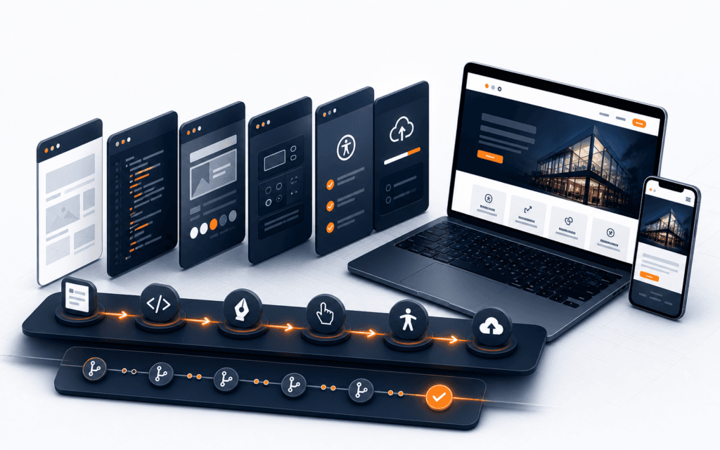
Learn web development in layers: semantic HTML, CSS and responsive design, JavaScript, Git, accessibility, testing and deployment, then specialization. Apply each layer to one small business website instead of starting a new project for every skill. This front-end-first sequence is not a complete back-end curriculum or a fixed completion promise. It helps you use limited study hours, produce visible progress, and choose your next direction from problems you have encountered.
The shortest useful roadmap: learn in seven layers
A useful web development skills roadmap follows dependencies. HTML gives content meaning. CSS turns that structure into a readable, flexible interface. JavaScript adds behavior. Git records the work. Accessibility changes how you design and test every layer. Testing and deployment expose problems that do not appear in an editor. Only then does specialization become an evidence-based choice.
That order broadly follows the platform foundations covered by the MDN front-end curriculum and its core learning modules. It is a sequence of capabilities, not a universal calendar.
| Layer | What to learn | Evidence in one business website |
|---|---|---|
| 1. HTML | Semantic structure, links, images, and forms | A complete page that works without styling |
| 2. CSS | Cascade, layout, typography, and responsive behavior | A readable interface across narrow and wide screens |
| 3. JavaScript | Data, functions, events, DOM updates, and errors | One useful interaction with clear feedback |
| 4. Git | Small commits, history, branches, and recovery | A reviewable record of project decisions |
| 5. Accessibility | Keyboard use, labels, focus, contrast, and semantics | Documented manual checks and fixes |
| 6. Testing and deployment | Cross-viewport checks, failure states, and release basics | A live URL with known limitations |
| 7. Specialization | Front-end depth, back-end needs, or broader full-stack work | A next step tied to an unresolved project requirement |
Start with the browser platform before a framework
Frameworks are useful when an interface has enough repeated state, components, and data flow to justify their structure. They are a poor substitute for understanding what the browser already does. If you cannot explain a page’s landmarks, CSS cascade, event behavior, or form semantics, a framework can hide the gap without removing it.
Start by building a navigation menu with HTML, CSS, and a small amount of JavaScript. Make the links usable without JavaScript. Add a button only if the compact layout needs one. Connect its expanded state to both the visual presentation and the appropriate accessibility state. This exercise teaches structure, layout, events, and progressive enhancement in one bounded feature.
The point is not to avoid frameworks. It is to make them legible. With platform knowledge, you can see which work a framework performs and which browser rules still apply. Framework APIs change; the relationship between content, presentation, behavior, and browser constraints remains useful.
Use web design as the first quality layer
A developer does not need to become a specialist visual designer before building a site. You do need enough design judgment to organize content, create a clear reading path, make layouts adapt, and communicate interaction states. Design is not a decorative step after coding. It is the set of decisions that determines whether a person can understand and use what you built.
Begin with a one-page brief for a local service business. Name the audience, the main task, the most important page action, and the content needed to support it. Turn that brief into a content hierarchy before choosing colors. A heading should describe the section that follows. Related information should appear together. Primary and secondary actions should not compete visually.
Then choose a limited type scale, spacing rhythm, content width, and a few reusable colors with sufficient contrast. Treat responsive design as more than three fixed breakpoints. The web.dev responsive design course covers layouts, typography, images, accessibility, interaction, and user preferences because the experience must adapt as a whole.
Check the result with a keyboard as well as a pointer. Focus should be visible. Controls need clear names and useful states. Form feedback should identify the problem without relying on color alone. The current WAI overview recommends using the latest WCAG 2 version, while the normative WCAG 2.2 recommendation groups accessibility under perceivable, operable, understandable, and robust principles. A short project checklist can reveal problems, but it does not by itself prove WCAG conformance.
If design decisions are the main gap in your capstone, Rising Edge’s responsive web design foundations provide an optional structured route for practising them. Continue only if that matches the evidence from your project.
Build one project in four repeatable cycles
Limited time becomes easier to manage when each work session produces one observable change. Use a simple loop: plan one outcome, build the smallest useful slice, test it, then record the next change. The loop can fit a short evening or span several sessions. Its value comes from a clear finish condition, not a fixed schedule.
For example, plan a semantic service page, build its essential content, test its reading order and links, then record the first layout task. In the next cycle, improve the layout without rewriting the content. Later cycles can add form behavior and deployment.
Git supports the review part of the loop. As the official Git introduction to version control explains, version control records changes over time so earlier versions can be compared or recovered. Commit after a coherent improvement, not after an arbitrary amount of time.
Milestone 1: structure and content
The first working version should contain real content and meaningful structure, even if it looks plain. For a local-service homepage, include a clear site header, main content, service summary, proof or supporting information, contact method, and footer. Use headings in a logical order. Make links describe their destinations. Give images useful alternative text when they convey information, and leave decorative images out of the first milestone.
Add a form only if the business goal requires it. Give every field a visible label and an appropriate input type. The acceptance test concerns meaning: can someone understand the page, follow its links, and complete its essential form without custom styling?
Structure comes first because CSS and JavaScript depend on it. If the HTML does not communicate the content correctly, styling can make the page appear finished while preserving a weak foundation.
Milestone 2: responsive visual system
Now translate the brief into a reusable system rather than styling each element independently. Define a small set of spacing and type values, then use them consistently. Build flexible layouts with grid or flexbox where their behavior fits the content. Let components wrap or stack according to available space instead of forcing every device into one of three assumed widths.
Images should not overflow their containers, and important content should not disappear when the viewport narrows. Test the navigation, service cards, and form at several widths, including awkward widths between common device presets. Increase text size to see whether containers grow. Check touch targets on a phone and move through every interactive element with the keyboard.
Record failures as tasks. A card title wrapping to two lines is not automatically a defect; a button moving off-screen is. Completion evidence should include screenshots at several widths plus notes from a keyboard-only pass.
Milestone 3: interaction with JavaScript
Add behavior only when it improves the capstone. A good first feature is client-side form feedback. It gives you a reason to practise variables, functions, conditions, events, DOM selection, text updates, and error states without inventing a large application.
Start with the browser’s native form capabilities. Use JavaScript to improve feedback, not to remove semantic labels or basic validation. On submission, distinguish empty fields from invalid values, place a useful message near the affected control, and move focus only when doing so helps the user recover. Keep the entered data when validation fails.
Test the successful path, empty input, invalid input, repeated submission, and keyboard use. If the feature does not need remote data, leave asynchronous requests for a later project. Client-side checks also do not replace server-side validation in a real production form. Stating that boundary shows that you understand both the feature and its limitations.
Milestone 4: version, test, and deploy
The project becomes reviewable evidence when another person can inspect both the result and the decisions behind it. Make small Git commits with messages that describe the change, such as “Add semantic contact form” or “Fix keyboard focus in mobile navigation.” The history should show how the site developed, not one final upload.
Write a concise README with the project’s purpose, audience, setup steps, and design decisions. Add a test matrix covering viewports, keyboard navigation, form states, links, and a current browser. Automated tools can assist, but accessibility guidance includes human evaluation, so do not treat one automated score as proof of conformance.
Deploy the site to a public URL and repeat the essential checks there. Paths, assets, environment settings, and forms can behave differently after deployment. Finish by recording two honest limitations, such as missing server-side form handling or incomplete testing on assistive technology. A live URL, repository, focused history, test notes, and known limitations are stronger evidence than a polished screenshot alone.
Decide what to learn next from project evidence
Choose your next subject by examining the capstone’s hardest unresolved requirement, not by following a fashionable tool.
| Project evidence | Next learning direction | Reason |
|---|---|---|
| Repeated interface patterns and increasingly complex client-side state | A front-end framework | Component and state models may now solve a problem you understand |
| Persistent data, authentication, secure form processing, or third-party integrations | Back-end fundamentals | The missing capability lives beyond browser-only code |
| Weak hierarchy, inconsistent layouts, or confusing interaction feedback | Deeper web design and accessibility practice | More code will not repair an unclear interface |
| Reliable browser and server features that must work together | A bounded full-stack project | You have a concrete reason to connect both sides |
Before choosing a framework, refactor one repeated interface pattern with platform code. If state management remains difficult, evaluate framework concepts against that known problem. Before back-end work, write the exact data and security requirements. “Add a database” is vague; “store enquiries, validate them on the server, and restrict staff access” defines a learning target.
This decision can point back to an earlier layer. If users cannot find the main action or the form is difficult to operate, deepen design and accessibility first. Returning to fundamentals is progress when the project evidence calls for it.
Avoid six traps that waste limited learning time
- Tutorial hopping: Finish a small capstone change before opening another course. Write down the problem you expect the new material to solve.
- Stack collecting: Keep a parking list for interesting tools. Add a tool to the active project only when a requirement justifies it.
- Copying a design without understanding hierarchy: Recreate the page outline in plain text and explain why each section exists before copying visual details.
- Leaving accessibility until the end: Include keyboard, label, focus, and contrast checks in each milestone. Late fixes often expose structural decisions that should have been made earlier.
- Choosing a project too large to test: Limit the first capstone to a few complete pages or one complete journey. A small deployed site with documented tests teaches more than a broad collection of unfinished features.
- Keeping no version history: Commit coherent changes and review the diff. If you cannot describe what changed and why, the work unit is probably too large.
Choose the next milestone, not the next tool
Start with a one-page brief. Write the user, their main task, the page that supports it, the success check, and your next focused build action. Then define Milestone 1 in terms you can verify: real content, semantic landmarks, working links, labelled controls, and a readable source file. Schedule a review point based on your availability, but do not attach your self-assessment to an arbitrary completion date.
When that milestone passes, choose the smallest change that exposes a new skill. Keep the project and let each unresolved requirement guide the next learning block.
Can I learn web development while working full time?
Yes, if you organize progress around verifiable milestones rather than a fixed weekly promise. Keep one capstone, define a small outcome for each cycle, and leave a written next action before stopping. The total pace will depend on your prior knowledge, project scope, and available time.
Should I learn web design before a JavaScript framework?
Learn enough design to create and assess hierarchy, typography, responsive layout, interaction states, and basic accessibility before relying on a framework. You do not need specialist-level visual design first. You do need to recognize when an interface is unclear or difficult to use, because a framework will not make those decisions for you.
A roadmap becomes more useful when each stage produces evidence, not just completed lessons. Learners who want guided practice across frontend, backend, databases, and deployment can compare that sequence with the Full Stack Web Development program and judge whether its project path matches their available time.
This topic also has a local training use for students in Gujrat, Punjab, Pakistan: this guide can be compared with practical exercises in the Full Stack Web Development. Confirm current batch requirements directly and judge the learning path by inspectable work.
Want to Build Practical Technology Skills?
Explore RisingEdge courses designed to help students learn real skills, build projects, and prepare for career opportunities.