Shopify Product Page Checklist: What Beginners Should Set Up First
A Shopify product page should help a customer understand the product, choose the right option, trust the store, and move confidently toward checkout. Beginners should set up.


A Shopify product page should help a customer understand the product, choose the right option, trust the store, and move confidently toward checkout. Beginners should set up accurate product details, images, variants, pricing, inventory, shipping context, sections, blocks, policies, and mobile layout before worrying about advanced apps or custom code.
Shopify’s official help pages explain that product information can include price, variants, availability, metafields, and other details, while theme templates use sections and blocks to control page layout. Shopify also documents checkout as the place where customers enter shipping and payment details after adding products to the cart. For Rising Edge learners, the Shopify Development course pairs well with Digital Marketing because product pages need both technical setup and persuasive clarity.
Start With Accurate Product Details
Product details are the foundation of the page. A beautiful design cannot fix missing size options, unclear pricing, weak descriptions, or wrong availability.
Beginners should complete the basics first: product title, description, media, price, compare-at price when appropriate, variants, inventory, shipping weight, product type, vendor, tags, and collections. Shopify’s product documentation shows that these fields are part of managing a catalog, not optional decoration.
The product title should be specific enough to identify the item. The description should explain who it is for, what problem it solves, what is included, and what the customer should know before buying. Avoid vague phrases like “high quality product” unless the page explains what quality means through material, use case, warranty, or proof.
Use Images That Answer Buying Questions
Product images should do more than look nice. They should answer questions a buyer would ask in a physical store. They should show the front, back, side, scale, important texture, and real use context.
A beginner product page should include a clear main image, supporting detail images, and lifestyle or context images when relevant. For digital products, screenshots, previews, or mockups can show what the buyer receives.
Image order matters. Put the clearest product image first, then add details and context. Do not make customers search for the basic view.
Set Variants and Options Clearly
Variants are easy to underestimate. If a product comes in sizes, colors, materials, bundles, or formats, those options must be clear. A customer should know what they are choosing and whether the choice changes price, availability, or delivery.
Shopify separates variant details from the general product details when variants exist. That means students should check each variant, not only the parent product. A missing price or inventory value on one variant can create customer confusion.
Use option names that customers understand. “Size” is better than “Option 1.” “Digital download” and “Printed copy” are clearer than “Type A” and “Type B.”
Build the Page Layout With Sections and Blocks
Shopify themes use templates, sections, and blocks to arrange content. The official theme structure documentation explains that templates contain sections and blocks that pull content dynamically from the admin.
For beginners, this means the product page is not only one description field. It can include product media, price, variant picker, buy buttons, collapsible details, trust badges, related products, reviews, shipping notes, and policy links.
Use sections to answer questions in order:
- Product identity.
- Intended customer.
- Available options.
- Proof or details that support the purchase.
- Expected next step after buying.
Do not overload the page with every available block. Each block should help the customer make a decision.
Add Trust and Policy Information
Trust is part of product page design. Customers need to know delivery expectations, return policy, payment security, support options, and what happens if something goes wrong.
This does not mean adding huge badges or loud promises. It means placing useful policy links or short notes near the buying decision. A simple shipping note, return summary, and support link can reduce hesitation.
For stores that sell locally, delivery areas and contact details matter. For digital products, access instructions and refund conditions matter. For custom products, production time and approval steps matter.
Check Mobile Before Publishing
Many customers will view the product page on a phone. A beginner should test the page on mobile before publishing. Product images should load in a sensible order. Variant selectors should be easy to tap. The buy button should not be buried under unnecessary content. Long descriptions should remain readable.
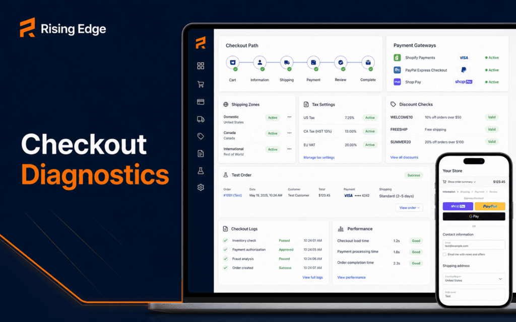
Mobile testing should include the full journey: view product, choose a variant, add to cart, review cart, and reach checkout. Shopify checkout handles the final payment flow, but the product page must prepare the customer to get there confidently.
Beginner Shopify Product Page Checklist
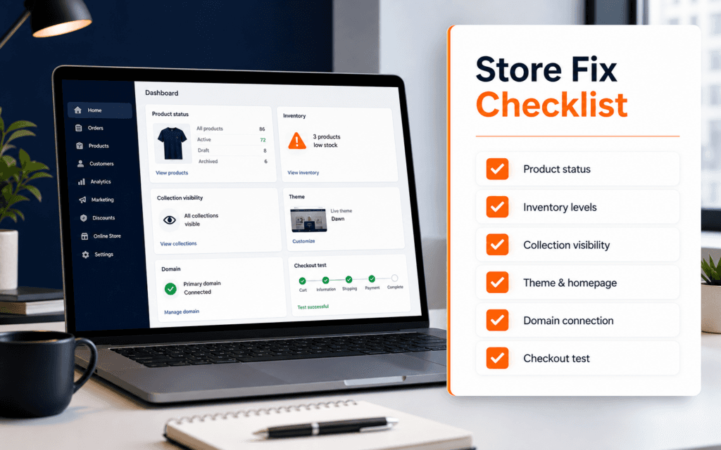
Use this checklist before launching a product:
- Product title is clear and specific.
- Description explains use case, details, and limitations.
- Main image shows the product clearly.
- Supporting images answer real buying questions.
- Variants have correct price, inventory, and names.
- Shipping or delivery context is visible where needed.
- Return/support policy is easy to find.
- Product appears in the right collection.
- Page sections follow a logical decision path.
- Mobile layout and checkout path are tested.
This checklist helps beginners build a product page that is ready for real customers, not only ready for a screenshot.
Common Mistakes Beginners Make
The first mistake is launching with incomplete product data. Missing variant information or unclear descriptions lead to support questions and abandoned carts.
The second mistake is using too many apps before fixing the page itself. Apps can add reviews, upsells, bundles, or subscriptions, but they cannot replace basic clarity.
The third mistake is writing descriptions only for the seller. Product copy should answer customer questions, not only list features.
The fourth mistake is ignoring mobile. If the product cannot be selected and added to cart easily on a phone, the page is not ready.
The fifth mistake is hiding policies. Customers should not have to search hard for delivery, returns, or support.
How to Review a Product Page Like a Customer
After setting up product data, review the page from the customer’s point of view. Do not start in the Shopify admin. Open the public product page on a phone and ask whether a new visitor can understand the offer in less than a minute.
The first screen should make the product recognizable. The customer should see a clear image, a specific title, the price, the available options, and the action they can take. If the first screen is crowded with badges, popups, or unrelated content, the page is making the buying decision harder.
Then check the questions a customer will ask before checkout: size or variant choice, included items, delivery expectation, return path, support availability, and whether the product matches the images. If the page does not answer those questions, customers may leave or contact support before buying.
This review is especially useful for beginners because it shifts attention away from theme decoration. The page is not finished when it looks attractive. It is finished when it answers the practical questions that stand between interest and checkout.
When to Add Apps or Custom Code
Apps and custom code can be useful, but they should come after the foundation. Reviews, bundles, subscriptions, size charts, advanced filters, and upsells all depend on accurate product data and a clear page structure. If the basic product page is weak, extra features may only add noise.
Use an app when it solves a specific customer or store-management problem. For example, a size chart app may help apparel shoppers choose correctly. A review app may help when the store has real customer feedback. A bundle app may help when products are commonly bought together. Each app should earn its place.
Custom code should also have a clear reason. A unique product configurator, custom metafield layout, or special comparison section may need development work. But beginners should first learn what the theme can already do with sections, blocks, and product fields.
This order keeps Shopify learning practical. First make the product understandable. Then make the buying path trustworthy. Then add features that solve proven problems.
A Simple Product Page Test Before Launch
Before launch, ask someone who has not worked on the store to complete a small task: choose the correct variant, add the product to cart, and explain what they expect to happen after checkout. Watch where they pause. Their confusion usually reveals what the page still needs.
If they hesitate at the variant picker, improve option names or add guidance. If they ask about delivery, move shipping context closer to the buying area. If they cannot tell what is included, rewrite the first part of the description. If they do not trust the store, make policy and support information easier to find.
This test does not require expensive tools. It requires attention. Beginners who run it learn that Shopify setup is not only admin work. It is a communication exercise where product data, design, theme structure, and checkout expectations must all support the same customer decision.
In Gujrat, Punjab, Pakistan, prospective learners can apply this checklist when discussing the Shopify Development with an admissions adviser. Questions should stay tied to current exercises, review methods, prerequisites, and project evidence.
FAQ
What should a beginner add to a Shopify product page first?
Start with accurate product details, images, price, variants, inventory, shipping context, policies, collection placement, and a mobile-tested layout.
Do Shopify product pages need custom code?
Not at the beginning. Many stores can create strong product pages with theme sections, blocks, good product data, and clear content before custom code is necessary.
How do sections and blocks help product pages?
Sections and blocks let store owners arrange product information, media, buy buttons, details, policies, and related content in a reusable layout.
Next Step
Choose one product and audit it with the checklist above. Fix product data, images, variants, trust information, and mobile flow before adding advanced apps or custom theme code.
Want to Build Practical Technology Skills?
Explore RisingEdge courses designed to help students learn real skills, build projects, and prepare for career opportunities.