Responsive Navigation QA: Keyboard, Touch, Focus, Resize
Responsive navigation QA verifies that one navigation system remains understandable and operable as viewport size, zoom, input method, route, content length, and menu state change.

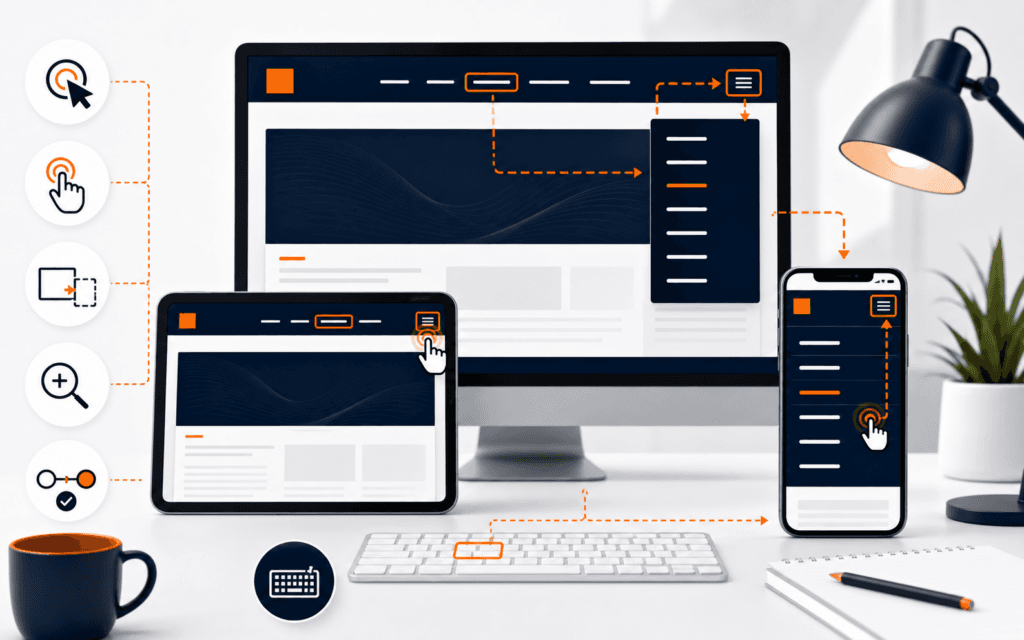
Responsive navigation QA verifies that one navigation system remains understandable and operable as viewport size, zoom, input method, route, content length, and menu state change. A screenshot cannot prove this. The tester must follow the trigger, menu, links, focus, page content, and browser history through realistic transitions and preserve evidence for each result.
Start with the maintained build and a test matrix, not a design mockup. Record browser, operating system, viewport, zoom, input method, route, authentication state, content variant, and build identifier. Test with fabricated accounts and public content; do not expose learner, client, or analytics data in screenshots or defect reports.
Define The Navigation Contract
List every navigation region, its purpose, trigger, destination set, current-page indicator, open and closed behavior, and supported input methods. State what changes at each breakpoint and what must remain invariant, including access to the same essential destinations and a reliable way to close transient menus.
Separate visual arrangement from behavior. A desktop row, compact disclosure, and off-canvas panel may render differently while sharing one information architecture. Document the intended state transitions so reviewers can distinguish a real defect from an unspecified design choice.
Build A State Matrix
Create rows for closed, opening, open, nested, closing, route-changed, resized, zoomed, loading, and error states. Create columns for pointer, touch, keyboard, screen reader review, narrow viewport, wide viewport, long labels, translated text, and reduced motion. Mark combinations that are impossible by design and explain why.
Prioritize transitions where defects hide: opening at one width then resizing, navigating with a submenu open, restoring a page from browser history, rotating a device, and switching from pointer to keyboard. A stable initial render does not cover these paths.
Verify Semantic Structure
Inspect whether the region has an appropriate navigation landmark and an accessible name when multiple navigation areas exist. Use native links for destinations and buttons for actions such as opening a menu. Confirm the trigger exposes an understandable name and state without relying on an icon alone.
Do not add roles or keyboard behavior that conflict with native HTML. A visually styled link is still navigation; a button that changes location may confuse browser and assistive-technology expectations. Keep labels consistent with visible language and avoid duplicate names that lead to different destinations.
Test Keyboard Entry And Exit
Begin before the header and press Tab through every interactive element. Confirm focus enters in a logical sequence, reaches the menu trigger and visible links, and can leave the component without a trap. Reverse with Shift+Tab and repeat after opening each disclosure or panel.
WCAG 2.2 requires keyboard operation for functionality and prohibits keyboard traps. Do not assume arrow keys are required unless the chosen interaction pattern defines them. Record the exact key, focused element, expected state, actual state, and next focus target for every failure.
Check Focus Order
Compare focus order with the reading and visual order in each responsive layout. CSS reordering can make a control appear first while it remains late in the document sequence. When a menu opens, hidden or background controls must not remain unexpectedly reachable before the menu’s relevant content.
W3C guidance says sequential focus should preserve meaning and operability. Test nested links, account controls, language selectors, and utility navigation as well as the primary menu. A logical order is task-based, not merely the numeric order assigned by a developer.
Inspect Visible Focus
Follow focus over every background, image, selected state, sticky header, and open panel. The indicator should remain visible, sufficiently distinct, and not be clipped by overflow. Test both keyboard entry and programmatic focus after opening or closing navigation.
Avoid removing browser outlines without an equivalent replacement. A color shift alone may disappear against nearby colors or be indistinguishable from hover and selected states. Capture the focused component and surrounding background at the failing viewport so the defect can be reproduced.
Manage Focus On Open And Close
Define whether focus remains on the trigger or moves into the newly opened region. Apply that decision consistently and ensure the focused element is visible. When Escape or the close control dismisses a panel, return focus to the invoking trigger unless the user has navigated elsewhere.
Do not force focus into ordinary content merely because it became visible. Modal and non-modal navigation patterns have different expectations. If the panel behaves modally, background interaction, focus containment, labelling, and restoration must all be implemented together rather than partially.
Test Touch And Pointer Targets
Use an actual touch device or reliable emulation to activate the trigger, close control, links, submenu controls, and account actions. Check spacing near screen edges and adjacent controls. A target that works with a precise mouse can still be difficult to acquire with a finger.
Test pointer cancellation and accidental movement rather than only successful taps. Avoid hover-only access to essential destinations. WCAG 2.2 includes target-size and input-modality criteria; evaluate the applicable level and document justified exceptions instead of estimating from a screenshot.
Resize While The Menu Is Open
Open the compact menu, enlarge the viewport past its breakpoint, then shrink it again. Confirm stale inline styles, scroll locks, inert states, overlays, and focus traps are cleared or intentionally transferred. Repeat from desktop to mobile with a submenu expanded.
A common defect leaves the page unscrollable or the trigger’s expanded state incorrect after resize. Observe the component state, body styles, focused element, and visible destinations after each transition. The recovery behavior should not require a full reload.
Test Zoom And Text Growth
Zoom the page and increase text size where supported. Confirm labels wrap without covering controls, the trigger remains available, and essential navigation does not require two-dimensional scrolling. Long course names, translated labels, and browser font overrides expose constraints hidden by short English text.
Do not classify a wrapped label as failure merely because it differs from the mockup. Fail when meaning, operation, visibility, order, or target access breaks. Record whether the issue begins at a particular zoom level, content length, or viewport combination.
Check Overlay Geometry
Inspect sticky headers, cookie notices, chat controls, browser UI, safe areas, and on-screen keyboards. The open menu, focused item, and close control must not be obscured. Scroll the panel to its first and last destination and verify content is neither clipped nor unreachable.
Use stable height and overflow rules so dynamic labels and status indicators do not shift the trigger or resize the header unexpectedly. Test short and tall viewports, not only common phone widths, because available height often determines whether an off-canvas menu remains operable.
Verify Route Changes
Activate every destination type, including same-page anchors, external links, authenticated routes, and the current page. Confirm the menu closes when appropriate, the new page receives a useful title and heading, and focus or scroll restoration follows the application’s documented navigation behavior.
Use browser Back and Forward after several transitions. Client-side routing can preserve an open overlay, stale current-page marker, or scroll lock. Verify both direct loads and in-app transitions because they may execute different code paths.
Test Failure And Loading States
Throttle the network and simulate a failed route or delayed account menu. Navigation should not disappear silently, submit duplicate actions, or leave an indefinite busy state. Preserve access to core public destinations when optional personalization fails.
Error messages must not expose tokens, internal paths, stack traces, or account details. Log a correlation identifier and bounded technical category for maintainers while showing users a safe recovery action such as retrying or returning to the primary navigation.
Review Motion And Dismissal
Check opening and closing with normal and reduced-motion preferences. Animation must not delay keyboard access, move focus unexpectedly, or make the final state ambiguous. The Escape key, close control, outside-pointer behavior, and route selection should follow one documented dismissal policy.
Rapidly alternate open and close actions to expose race conditions. The final visual state, expanded attribute, focus location, scroll lock, and overlay presence must agree. Debounce only where it preserves user intent rather than masking broken state management.
Run Assistive Technology Checks
Use at least one supported screen reader for a focused review of trigger name, expanded state, landmark names, link announcements, current-page state, and dynamic visibility. This complements keyboard testing; it does not replace code inspection or broader conformance evaluation.
Avoid claiming WCAG conformance from one tool or automated score. W3C’s easy checks are preliminary. Record the browser and assistive-technology combination, exact announcement, expected meaning, and reproducible interaction sequence for each finding.
Automate Stable Regressions
Add tests for trigger state, menu visibility, focus restoration, route closure, resize cleanup, and absence of hidden tabbable controls. Use semantic locators and assertions about observable behavior rather than animation timing or fragile class names.
Keep manual checks for touch feel, focus visibility across backgrounds, zoom, assistive-technology output, and unusual browser geometry. Automation should protect known contracts while the matrix identifies new combinations that deserve exploratory review.
Triage With Evidence
For each defect, save build, route, viewport, zoom, input method, initial state, steps, expected result, actual result, impact, screenshot or short recording, and relevant console error without sensitive data. Group symptoms only when they share a verified cause.
Prioritize blocked navigation, traps, hidden focus, inaccessible essential destinations, and unrecoverable overlays above cosmetic spacing differences. Retest the exact transition and nearby states after a fix, then attach evidence showing the maintained build now meets the contract.
Release And Monitor
Run the critical matrix against a production-like build before release. Verify minified assets, fonts, consent controls, analytics scripts, and real routing do not change behavior. Use a small rollout where possible and preserve rollback instructions for navigation code and configuration.
A Web Design course can provide guided practice with responsive structure and interaction. Production acceptance still requires project-specific browser support, accessibility review, real-content testing, and accountable sign-off.
Whether a learner attends in Gujrat or joins live online classes elsewhere in Pakistan, this checklist can serve as a project-quality standard for the Web Design and Front-End Development. The important signal is repeatable work supported by clear reasoning and review.
FAQ
Can responsive navigation be tested with screenshots?
No. Screenshots help review layout, but navigation QA must exercise state transitions, input methods, focus, resize, zoom, and routes.
Should focus always move into an opened mobile menu?
Not always. The documented interaction pattern decides; whatever behavior is chosen must be consistent, visible, operable, and restore focus appropriately.
Does an automated accessibility score prove the menu is accessible?
No. Automation can detect some issues, but keyboard, focus, touch, zoom, content, and assistive-technology behavior require additional review.
Want to Build Practical Technology Skills?
Explore RisingEdge courses designed to help students learn real skills, build projects, and prepare for career opportunities.