Responsive Data Tables: Semantics, Scrolling, Labels, Mobile QA
Responsive data tables preserve meaningful relationships among row headers, column headers, and values while adapting to smaller viewports, zoom, long content, and different input.

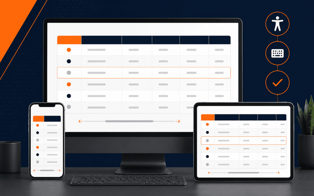
Responsive data tables preserve meaningful relationships among row headers, column headers, and values while adapting to smaller viewports, zoom, long content, and different input methods. The goal is not to make every column visible at once on a phone. It is to let readers identify what the data represents, navigate it, compare the fields required for their task, and recover context without horizontal page overflow or hidden information.
Start with real data and a written comparison task, then preserve native HTML semantics before styling. W3C guidance recommends header and data-cell markup that communicates relationships to assistive technology and prefers native HTML tables over recreated ARIA structures when the content is an ordinary static table. Responsive behavior is a presentation decision; it must not destroy that source of truth.
Confirm The Content Is Tabular
Use a data table when values have meaningful two-dimensional relationships and readers need row and column context. Examples include schedules, pricing comparisons, specifications, results, and account records. Read a few cells aloud with their row and column headers to test the relationship.
Do not use a table only to align a form, gallery, or page layout. Use CSS layout for presentation. Conversely, do not replace genuine comparison data with unrelated cards merely because the viewport is narrow.
Write The Reader Task
State what a reader must compare, locate, sort, or decide. Identify essential columns, useful secondary details, likely scan direction, and whether actions belong to a record. This determines which responsive strategies are acceptable.
Ask whether a summary or filter could reduce cognitive load before the table. A large dataset may need search, pagination, export, or a purpose-built grid, but adding controls should follow a demonstrated user task rather than visual ambition.
Preserve Native Structure
Use table, thead, tbody, tr, th, and td according to their meaning. Mark simple column headers with th and scope col, and row headers with th and scope row. W3C documents id and headers associations for genuinely complex relationships.
Avoid converting cells into div elements and attempting to recreate the complete model with ARIA. The WAI-ARIA Authoring Practices Guide strongly prefers the native HTML table when available. Native semantics also survive stylesheet failure more gracefully.
Give The Table A Name
Use a concise caption that identifies the table’s purpose. Add nearby explanatory text when readers need scope, date, units, or instructions. The name should remain available when the table is reached directly by navigation.
Do not put essential interpretation only in color, a tooltip, or a distant heading. If several tables appear on a page, captions should distinguish them without repeating an entire paragraph.
Keep Headers Specific
Write short headers that identify the dimension and unit, such as Duration (weeks) or Fee (PKR). Avoid unexplained abbreviations. When the unit applies to every value, place it in the header or caption rather than repeating it noisily in every cell.
Headers should remain correct if columns are reordered, hidden in a supplementary view, or exported. Do not use blank header cells to create spacing; spacing belongs in CSS.
Start With Intrinsic Layout
Allow text to wrap naturally and use sensible minimum and maximum widths based on content. Keep numeric columns compact and align numbers consistently where it improves comparison. Avoid fixed pixel widths that assume short English labels or desktop space.
Test names, long words, localized dates, large amounts, missing values, multi-line status text, and zoom before selecting breakpoints. Real content should drive constraints rather than a clean demonstration dataset.
Choose Horizontal Overflow Deliberately
For many comparison tables, a horizontally scrollable wrapper preserves columns and semantics with the least distortion. Keep the table itself wide enough for readable cells while containing overflow inside the component so the whole page does not pan sideways.
Make the scroll region keyboard reachable when required by the implementation and give it an accessible name. Provide a visible cue that more columns exist without covering content. Test touch, trackpad, keyboard, and high zoom.
Retain Context While Scrolling
A sticky header or first column can help, but test it carefully. Sticky layers must not obscure focused links, clip text, overlap other cells, or create unreadable stacks at narrow widths. Use opaque backgrounds and restrained shadows or borders.
Do not freeze so many columns that no movable space remains. At high zoom, simpler scrolling with clear headers may be more usable than an elaborate frozen interface.
Prioritize Without Deleting Data
When the task supports it, show essential columns initially and expose secondary fields through an explicit Details control or alternate view. The control label should identify the record and communicate expanded state.
Hidden columns must remain available and their relationships understandable. Do not hide legally required terms, decisive comparison criteria, or the only label for an action merely to make the layout fit.
Evaluate Stacked Presentations
A stacked mobile view can work when each row is an independent record and cross-row comparison is secondary. Repeat visible field labels for values and preserve a semantic table or equivalent structured representation that is tested with assistive technology.
Do not use CSS generated content as the only source of labels. It may not be consistently exposed or copied. Avoid duplicating both table and cards in the accessibility tree; maintain one authoritative representation per viewport state.
Distinguish Tables From Grids
A static table may contain ordinary links, buttons, or form controls, each of which remains a normal tab stop. An interactive grid adds composite keyboard behavior, focus management, selection, and often editing. That is a different component with much higher implementation cost.
Do not add role grid to make a table sound advanced. W3C distinguishes a table from an interactive grid. Choose the grid pattern only when users genuinely need two-dimensional widget navigation and the team can implement and test it fully.
Design Sorting Accessibly
Use a real button inside the sortable header. Its label should identify the column and resulting action, while aria-sort belongs on the currently sorted header according to the chosen pattern. Keep the focused control visible after sorting.
Sorting must not silently change unrelated filters, lose the user’s place, or announce decorative icons as text. Test equal values, missing values, localized text, numbers stored as strings, and stable ordering.
Handle Row Actions
Name actions with record context, such as View details for Course A, especially when every row repeats View or Edit. Keep destructive actions separated and protected by the application’s authorization and confirmation policy.
On narrow screens, an action menu can save space, but it must open, label, focus, dismiss, and return focus correctly. Do not rely on hover-only controls because touch and keyboard users may never discover them.
Represent Missing And Changed Values
Choose a consistent visible marker for unavailable, not applicable, zero, and not yet reported; these meanings are different. Explain unusual symbols in text and ensure screen readers receive the intended phrase.
For live updates, preserve focus and announce meaningful changes without flooding users. A visual flash or color change alone is insufficient. Allow readers to pause frequent updates when the context requires it.
Control Visual Density
Use spacing, borders, alignment, type weight, and alternating treatment sparingly to separate records and hierarchy. Maintain sufficient contrast and visible focus. The design token audit can catch inconsistent colors, type, spacing, and states.
Do not shrink text below the site’s readable scale to avoid scrolling. Dense tables can remain professional when headers are concise, cell padding is consistent, and secondary information is deliberately de-emphasized rather than compressed indiscriminately.
Test Reflow And Zoom
Test at 320 CSS pixels and at 400 percent browser zoom where applicable. The page should not require horizontal scrolling for unrelated content; a contained data region may scroll when the information genuinely needs two dimensions. Confirm controls and labels remain available.
Review portrait and landscape layouts, browser text enlargement, long translations, and operating-system font scaling. A breakpoint that passes with sample English data may fail when a single real label wraps.
Run Keyboard And Screen Reader QA
Navigate into, through, and beyond the component using only the keyboard. Verify visible focus, logical order, sortable controls, details disclosures, menus, and the scroll region. Screen-reader testing should confirm the table name and row and column header associations.
Test the supported browser and assistive-technology combinations defined by the project, not one automated checker alone. Automation can find missing markup, but it cannot prove that a complex comparison remains understandable.
Test Real States And Failures
Include loading, empty, partial, error, permission-limited, long-data, many-row, and no-JavaScript states where relevant. Preserve column meaning when skeletons disappear. Error messages should identify what failed and provide a safe recovery action.
Use the responsive layout QA process to cover breakpoints, content extremes, input devices, and orientation. Record screenshots and defects against the same dataset and component version.
Ship With A Component Contract
Document supported table complexity, responsive strategy, caption rules, header associations, controls, empty states, zoom behavior, and test matrix. Prevent consumers from inserting arbitrary nested controls or removing required labels.
The Web Design course can build practical judgment across content structure, layout, interaction, and responsive behavior. A reusable component still needs content-specific QA because each dataset changes width, hierarchy, and comparison demands.
Whether a learner attends in Gujrat or joins live online classes elsewhere in Pakistan, this checklist can serve as a project-quality standard for the Web Design and Front-End Development. The important signal is repeatable work supported by clear reasoning and review.
FAQ
Should every mobile table become cards?
No. Cards can weaken cross-row comparison and header relationships. Choose them only when each row is an independent record and the alternate presentation remains structured and tested.
Is horizontal scrolling inaccessible?
Not inherently. A contained, named, discoverable scroll region can preserve important relationships, but it must be tested with keyboard, touch, zoom, and assistive technology.
When should I use an ARIA grid?
Use a grid only for a genuinely interactive two-dimensional widget with implemented keyboard and focus behavior. Prefer a native HTML table for static tabular information.
Want to Build Practical Technology Skills?
Explore RisingEdge courses designed to help students learn real skills, build projects, and prepare for career opportunities.