Course Website Information Architecture: Find, Compare, Decide, Apply
Course website information architecture should help a prospective learner complete five decisions: find the relevant subject, compare suitable courses, understand what the learning.


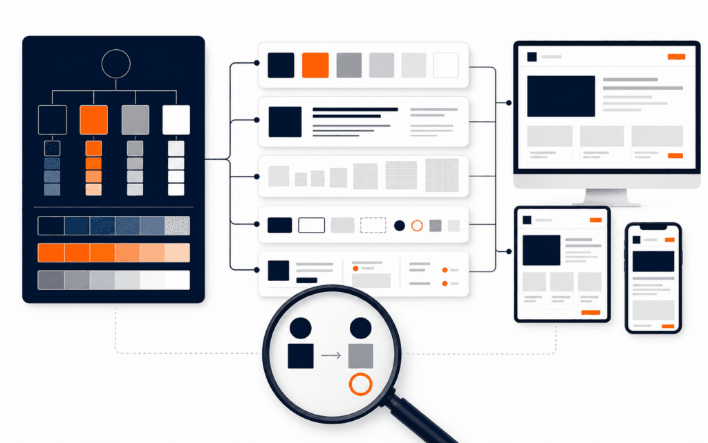
Course website information architecture should help a prospective learner complete five decisions: find the relevant subject, compare suitable courses, understand what the learning requires, decide whether the option fits, and move into admissions or contact with the right context. Organize navigation and page content around those decisions, not the institute’s internal departments or a list of promotional features.
The architecture needs more than a sitemap. Define a governed course content model, stable page types, descriptive links, consistent navigation, semantic headings, ownership, update rules, and scenario-based tests. A visitor should not have to open several tabs to discover duration, level, prerequisites, format, outcomes, or the next step, and search engines should be able to follow the same real links people use.
Write The Learner Decisions
List the questions a prospective learner must answer before acting: Is this subject relevant? What will I learn? What level is it? How is it delivered? What time and effort does it require? What evidence or projects will I produce? What are the prerequisites, policies, fees, and admissions steps? Which details require staff confirmation?
Separate discovery questions from eligibility and transaction questions. The public website can explain programs, compare options, and describe the application process, while authorized staff may own final eligibility, current availability, payment, and enrollment. Naming that boundary prevents design copy from making promises the system cannot maintain.
Define The Core Page Types
Use a small set of page types with clear purposes: course catalog, subject or category landing page when needed, individual course page, admissions, contact, policies, and supporting guides. Every page should have one primary job and a clear route to the next relevant decision.
Avoid creating separate pages for every keyword variation or internal team. A page earns its place when it serves a distinct user need, owns unique maintained information, and connects to the hierarchy. Merge thin pages that repeat the same summary and route unsupported requests to a useful parent rather than leaving dead ends.
Create A Governed Course Model
Define reusable fields such as official course name, concise summary, audience, level, prerequisites, learning outcomes, modules, project evidence, delivery mode, duration, schedule status, tools, assessment, certification wording, fee status, owner, review date, and admissions route. Mark which fields are required, optional, conditional, or staff-confirmed.
Do not fill missing fields with generic claims. Show an honest status or route the visitor to contact when a detail is not published. Keep each fact in one authoritative record where possible so the catalog, course page, structured data, search result, and enquiry context do not drift into conflicting versions.
Design The Catalog For Recognition
The course catalog should help visitors scan subject, level, format, and outcome without decoding internal terminology. Use descriptive names, concise summaries, and a stable card pattern. Filters are useful only when the collection is large enough, the attributes are reliable, and the same result remains reachable without a fragile interface state.
Provide a sensible default order and useful empty state. Preserve selected filters in the URL when sharing or returning matters. On mobile, keep result count and active filters understandable, and do not hide the entire catalog behind a modal. A search box should complement the hierarchy, not compensate for unclear categories.
Build Course Pages For Comparison
Place the decision-critical summary near the beginning: what the course teaches, who it is for, level, prerequisites, delivery, duration or current status, and the primary next step. Follow with learning outcomes, curriculum, projects, assessment, tools, instructor or support context when verified, policies, FAQs, and admissions details.
Use the same field order across course pages so visitors can compare without relearning the layout. Consistency does not require identical content length. Conditional sections should disappear cleanly when not applicable rather than showing empty headings or placeholder copy. Keep claims specific and owned.
Use Headings As A Page Map
W3C page-structure guidance explains that semantic regions and headings support navigation and understanding. Use one descriptive page heading, then H2 sections that match learner questions and H3 subsections only where they clarify real groups. Do not choose heading levels for visual size.
Headings should work when read as an outline: Course overview, Who this is for, What you will learn, Curriculum, Projects and assessment, Requirements, Delivery and schedule, Admissions, and Questions. Avoid vague headings such as Transform Your Future when the following section contains prerequisites or duration.
Keep Navigation Consistent
Use a stable primary navigation for courses, admissions, and contact, with the same relative order across pages. W3C’s consistent-navigation guidance supports predictable repeated mechanisms. Show the current location through page title and breadcrumb or equivalent context when the hierarchy is more than one level deep.
Do not let course pages become isolated campaigns with different menus and labels. A learner who enters from search should be able to reach the catalog, related courses, admissions, policies, and contact without returning to the home page. Keep mobile and desktop labels semantically consistent even when their presentation changes.
Write Descriptive Crawlable Links
Use real anchor elements with href destinations for navigation and contextual links. Google documents anchor links with href attributes as reliably crawlable. Name the destination in the anchor: view the Full Stack Web Development course, compare all courses, or review the admissions process. Avoid click here and JavaScript-only navigation for essential routes.
Link courses from the catalog and relevant category pages, and link back to the catalog from each course. Add contextual links only where they help the current decision. The Rising Edge courses catalog and admissions process should be reachable as natural steps, not repeated promotional blocks after every section.
Connect Search To The Canonical Structure
Give each course one stable public URL and canonical identity. Use the official course name consistently in the title, page heading, internal links, metadata, and structured content where accurate. Do not publish multiple near-identical pages for beginner, institute, city, or career variations that all answer the same intent.
Include useful language naturally in summaries and headings, but let the content model control facts. Search snippets can change, and rankings are not guaranteed. The architecture improves discovery by making destinations unique, connected, and understandable; it does not replace evidence, quality, technical indexing, or ongoing maintenance.
Design Admissions As A Continuation
The course page should pass useful context into the next step, such as the selected course identifier, without exposing private data in URLs. Admissions should explain the process, required information, review boundary, response channel, and what happens after submission. Contact should remain available for unresolved questions.
Keep forms proportionate and explain why information is needed. Use visible labels, clear validation, accessible errors, privacy context, and a recoverable submission state. Do not ask for sensitive documents or payment details through a general enquiry form unless the approved process and security controls support it.
Plan Error And Change States
Course information changes. Define what happens when a course is paused, renamed, replaced, or retired. Preserve the URL when the course still has useful historical or transition information; otherwise use an intentional redirect to the closest relevant maintained destination. Never redirect every missing course to the home page.
Design zero results, unavailable schedule, closed applications, missing optional detail, and failed form submission as real states. Each should explain the condition and offer a safe next action. Remove placeholder dates, lorem ipsum, draft fees, and internal approval notes before publication.
Assign Content Ownership
Every maintained field and page needs an owner, evidence source, review frequency, and escalation route. Academic or training staff may own curriculum, admissions owns process and eligibility wording, finance owns approved fees, and the web team owns presentation and technical integrity. Record approvals without exposing private internal material.
Use a review queue triggered by schedule, policy, curriculum, staff, fee, or course-status changes. Show a public updated date only when it is meaningful and reliably maintained. Stale detail damages decisions even when the visual design is excellent.
Test With Decision Scenarios
Write scenarios instead of asking whether the navigation looks good. For example: a beginner interested in AI must find an appropriate course, understand prerequisites and delivery, compare it with a related option, and reach admissions. A working professional must verify schedule status and contact staff without losing the selected course context.
Run scenarios at mobile and desktop widths with keyboard input, zoom, slow loading, no search-engine context, and direct entry to an individual course page. Record path, clicks only when useful, wrong turns, missing information, unclear labels, focus behavior, and completion. Revise the architecture when several failures share the same cause.
Measure Findability Without Hiding Context
Use first-party search terms, catalog filter use, course-page paths, admissions starts, completed enquiries, and support questions as bounded evidence. Define each event and test it. A click to admissions is not an accepted application, and a long page visit is not automatically engagement.
Review failed searches, repeated backtracking, exits after missing details, and questions that reveal absent content. Pair analytics with interviews or moderated tasks because a chart cannot explain every intent. Collect only needed data under the applicable consent and retention rules.
Publish A Minimum Coherent Architecture
A small institute can begin with a clear course catalog, complete course pages using one model, admissions, contact, essential policies, a consistent header and footer, descriptive links, sitemap coverage, and assigned owners. That coherent structure is more useful than many thin category and campaign pages.
Review the live Rising Edge courses as the catalog entry point. As the offering grows, add comparison, subject landing pages, filters, guides, or learner resources only when maintained content and observed decisions justify them. The architecture should grow through governed needs, not page-count targets.
This information architecture can be treated as a real brief for the Web Design and Front-End Development program. The design task is to make course comparison and admissions decisions easier without hiding important conditions behind decorative layouts.
Students considering the Web Design and Front-End Development can practise this comparison framework from Gujrat or through live online classes across Pakistan. This makes the course decision more concrete because the learner can evaluate the subject through an actual workflow instead of a broad description.
FAQ
How many levels should a course website hierarchy have?
Keep it as shallow as the maintained content allows. Most visitors should move from catalog or subject page to a course, then to admissions or contact without unnecessary intermediate pages.
Should every course have its own page?
Yes when it has distinct, maintained decision information and a stable identity. Do not create separate pages for minor keyword variations of the same offering.
What should appear first on a course page?
Show the course purpose, intended learner, level, prerequisites, delivery, duration or current status, and next step before extended promotional or curriculum detail.
Want to Build Practical Technology Skills?
Explore RisingEdge courses designed to help students learn real skills, build projects, and prepare for career opportunities.