Cart UX Checklist: Quantity, Errors, Checkout Path
Cart UX reviews help store teams find buying-path problems before customers abandon the order. The practical workflow is to check cart entry points, product details, quantity.

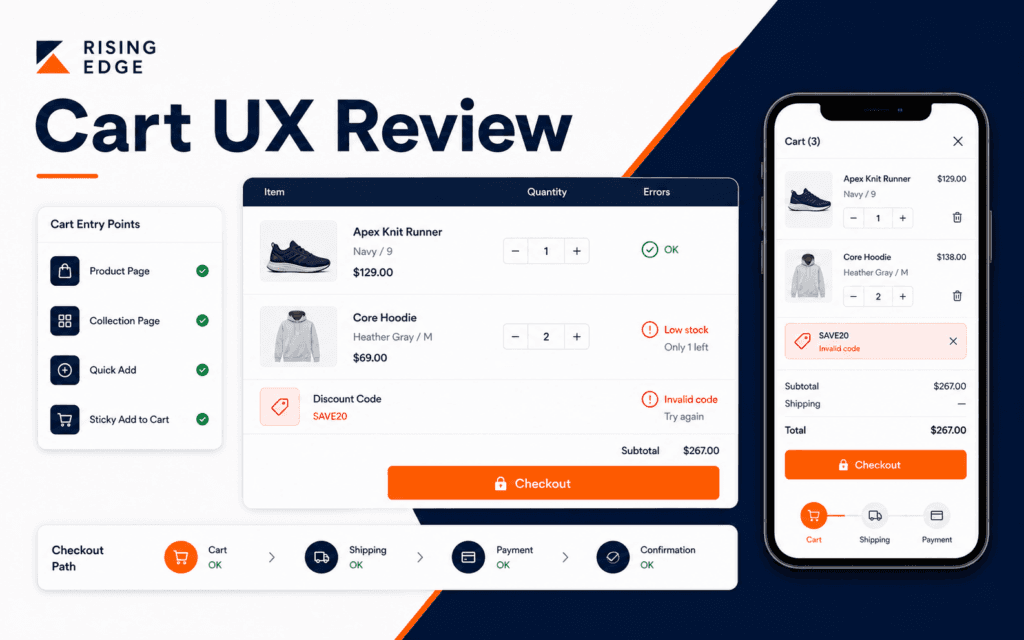
Cart UX reviews help store teams find buying-path problems before customers abandon the order. The practical workflow is to check cart entry points, product details, quantity controls, discount and shipping expectations, error messages, empty-cart behavior, checkout button visibility, mobile layout, and the transition into Shopify Checkout. Use this checklist to diagnose and resolve the problem when shoppers can add products but the cart or checkout path still feels uncertain.
Shopify checkout documentation shows that checkout settings cover form options, account pages, address collection, and order processing controls. The cart is the step that prepares customers for that checkout path, so it needs its own review.
Start With Cart Entry Points
Customers can reach the cart from product pages, collection cards, quick-add buttons, cart icons, cart drawers, cart pages, campaign links, and sometimes cart permalinks. Test the entry points that your theme and store actually use.
Product pages are only one route into the cart. A quick-add button from a collection may create a different path from a product-page add-to-cart button. A cart drawer may behave differently from a full cart page.
Write the expected path: add product, view cart, review quantity, see costs or notices, continue shopping or checkout. If any step is unclear, the cart needs improvement.
The Shopify Development course connects to this because store setup is not only product upload. It includes the full route from product discovery to checkout.
Check Product Details In The Cart
Cart rows should show enough product information for shoppers to confirm what they selected. Product title, image, variant, quantity, price, and availability matter. When the product has size, color, course package, or digital access type, the cart should make that visible.
Do not force shoppers to return to the product page to confirm basic details. That adds friction and can create doubt.
Small or cropped product images may mean the theme is using the wrong image ratio. Unclear variant names usually point back to product data, not only cart layout.
For stores with many variants, variant display is especially important. Wrong size or color surprises create support requests and returns.
Test Quantity Controls
Quantity controls should be clear, easy to tap, and protected against invalid values. Test plus, minus, manual entry if available, zero quantity, maximum quantity, and inventory limits.
When quantity changes, totals should update clearly. Slow updates need progress feedback. Failed updates need a message that explains what happened and how to recover.
For mobile, quantity controls need enough spacing. A tiny minus button next to a remove button can cause mistakes.
If the store limits quantity, explain the limit near the control. Silent correction feels broken. Clear messaging feels intentional.
Write Helpful Cart Errors
Cart errors should explain the issue and the next action. Out of stock, variant unavailable, discount not valid, address required later, or checkout unavailable should not all become the same generic message.
Keep errors close to the affected item or action. If a discount fails, show the message near the discount field. If a product cannot be purchased, show it near the product row.
Do not expose raw technical details to customers. Keep internal diagnostics in logs or admin tools. The public cart should be calm and actionable.
The Web Design course is relevant because cart errors are interface content, not only backend responses.
Make The Checkout Path Obvious
The checkout button should be visible, readable, and visually stronger than secondary actions. Continue shopping can be present, but it should not compete with checkout when the customer is ready to buy.
Shopify documentation explains that the checkout and accounts editor can customize checkout, thank you, order status, and customer account pages separately from the theme editor. That means cart design and checkout styling may be controlled in different places.
Check the transition into checkout. The button should lead to the expected Shopify Checkout path, preserve cart items, and avoid surprising redirects.
Stores that use cart permalinks for campaigns or preloaded carts need separate testing. Shopify documentation explains that these links can send customers to checkout with selected variants already loaded.
Review Empty Cart And Continue Shopping
The empty cart should help customers recover. It can link to collections, featured products, or the main shop page. It should not feel like a dead end.
Avoid empty-cart pages with only a blank message. A customer who removed an item may still want to browse. Give them a sensible next step.
An empty cart drawer after a failed add-to-cart action needs a clear error. Without an explanation, shoppers may think the store is broken.
For marketing campaigns, an empty or expired cart link should still route users toward a useful page.
Check Mobile Cart Behavior
Mobile cart UX needs real testing. Test the cart drawer or page with one item, multiple items, long product names, variant names, discount field, checkout button, and keyboard input.
Check whether the checkout button remains reachable. Sticky buttons can help, but they should not cover product details, messages, or terms.
Also test scroll behavior. Drawers that trap scroll, background pages that move accidentally, and hidden close buttons can make a cart feel unreliable.
The Digital Marketing course is relevant because campaign traffic often reaches product or cart paths from mobile devices.
Align Cart And Checkout Branding
Shopify checkout style settings can control images, typography, colors, and buttons in the checkout editor. Review the cart and checkout together so the transition feels trustworthy.
Sharp style changes between cart and checkout can make customers feel they left the store. Brand consistency matters at the point of payment.
Still, do not sacrifice readability for brand color. Checkout and cart buttons need contrast, clear labels, and enough spacing.
Verify Discounts, Notes, And Policies
Cart UX often includes discount fields, order notes, shipping notices, taxes, return policy links, and free-shipping messages. These details shape customer expectations before checkout.
Test a valid discount and an invalid discount. The success state should be obvious, and the error state should explain why the code did not apply. Avoid vague messages when the real issue is expiration, product exclusion, minimum order value, or spelling.
Policy links should be reachable before checkout. Customers may want shipping, returns, privacy, or contact information before they commit. Footer links help, but cart-adjacent policy links can reduce hesitation when the purchase decision is active.
Audit Cart Performance
Cart drawers and cart pages should feel responsive. Slow scripts, heavy images, third-party apps, and repeated API calls can make the cart lag. Lag near checkout feels risky to customers.
Test cart actions on a slower connection. Add item, change quantity, remove item, apply discount, and click checkout. Watch for delayed totals, double clicks, stuck loading states, or buttons that become active too early.
If apps modify the cart, test after app updates. Cart-related apps can affect discounts, upsells, shipping bars, bundles, subscriptions, or checkout flow.
Create A Cart QA Handoff
A cart QA handoff should include the tested theme, cart type, product examples, variant examples, discount codes, shipping or policy notices, mobile viewport, apps that affect the cart, and the expected checkout path. This keeps review practical.
Include at least one normal path and several failure paths. A normal path can be add product, change quantity, apply valid discount, and checkout. Failure paths can include invalid discount, unavailable variant, quantity limit, empty cart, and slow response.
Record what should happen after each action. If the quantity changes, totals update. If a discount fails, the message appears near the field. If checkout opens, the cart items remain intact. These expectations make testing clearer for the next person.
Cart QA should happen after theme edits, app installs, product-data changes, discount setup, and checkout-setting changes. The cart is too close to revenue to leave untested after those updates.
Keep the handoff with the store maintenance notes.
Final Cart UX Checklist
Before publishing cart changes, confirm cart entry points, product details, variant display, quantity controls, inventory behavior, discount behavior, error messages, empty-cart path, checkout button, checkout transition, mobile layout, cart permalink behavior where used, and brand consistency.
Also test a failed path. Add an unavailable variant, use an invalid discount, change quantity beyond a limit, and try a slow connection. Strong cart UX handles problems without panic.
Common Cart UX Mistakes
The first mistake is testing only one product. The second is hiding variant details. The third is using generic errors. The fourth is making checkout visually weak. The fifth is ignoring cart drawers on mobile.
This checklist can become a practical review exercise within the UI/UX Design program: map the cart states, identify uncertainty, prototype the correction, and retest the complete checkout path. That process connects interface decisions to observable user outcomes.
Test recovery, not only the ideal purchase. Change quantity, remove an unavailable item, return from checkout, and reopen the cart on a smaller screen to verify that state and explanations remain clear.
For a learner comparing classroom training in Gujrat, Punjab, Pakistan, this checklist turns interest in the UI/UX Design into concrete evaluation criteria. It clarifies which decisions and checks should appear in credible practical work.
FAQ
What should a cart show?
A strong cart should show product title, image, variant, quantity, price, subtotal, relevant notices, errors, and a clear checkout action.
Why does cart UX matter?
This step is where shoppers confirm decisions before checkout. Confusion here can stop an otherwise qualified buyer who was otherwise ready.
Should cart and checkout look the same?
They should feel consistent, but each step can have its own layout. The transition should be clear, trustworthy, and readable.
Want to Build Practical Technology Skills?
Explore RisingEdge courses designed to help students learn real skills, build projects, and prepare for career opportunities.